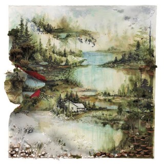
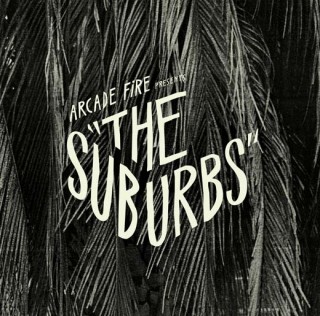
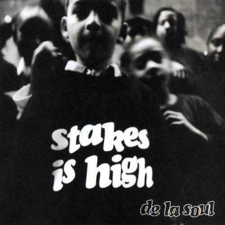
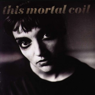
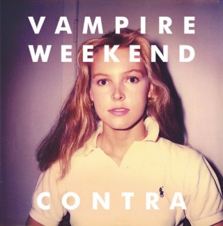
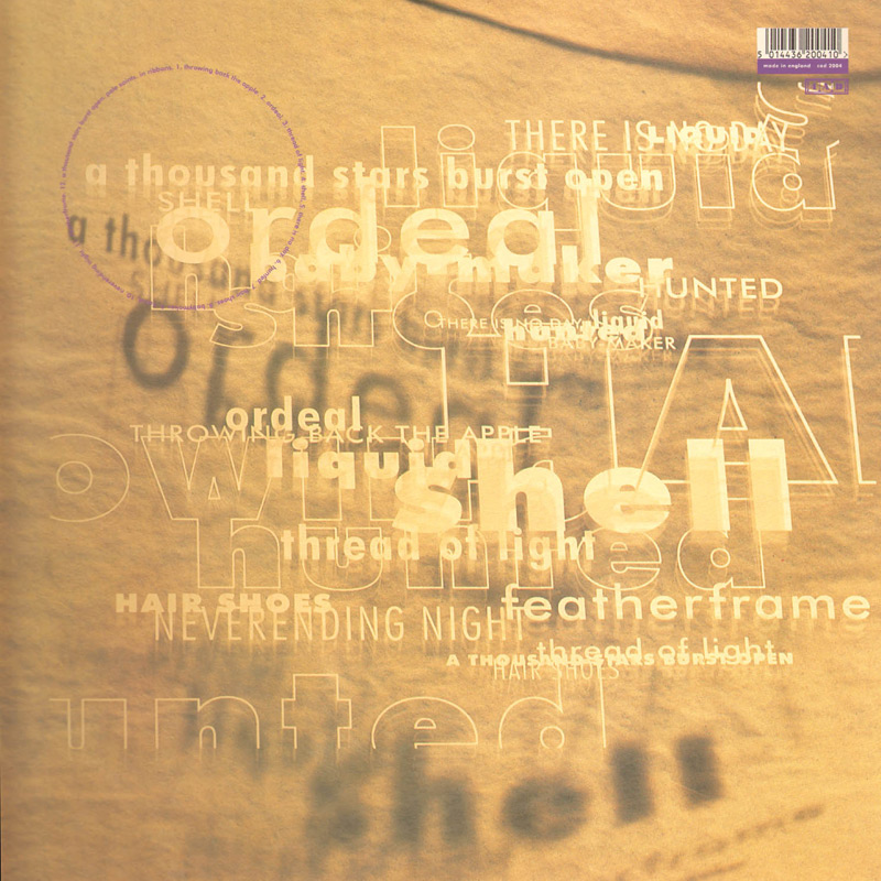
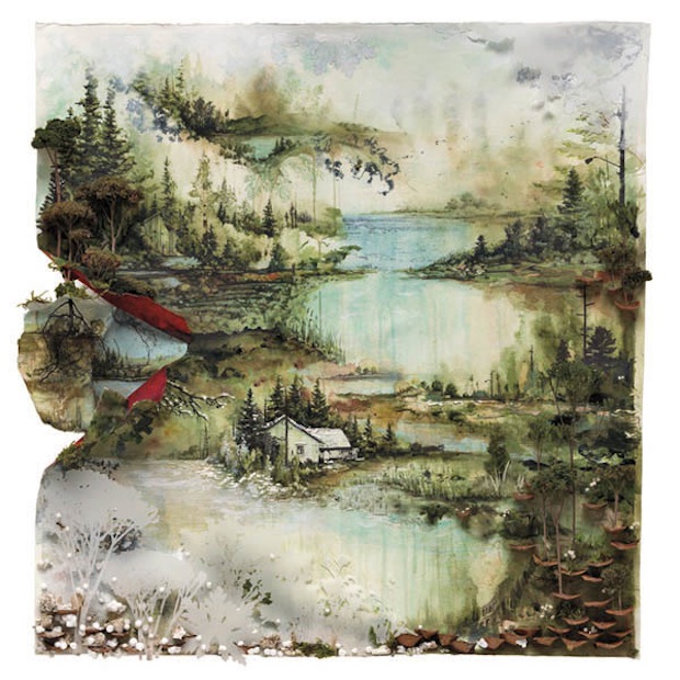
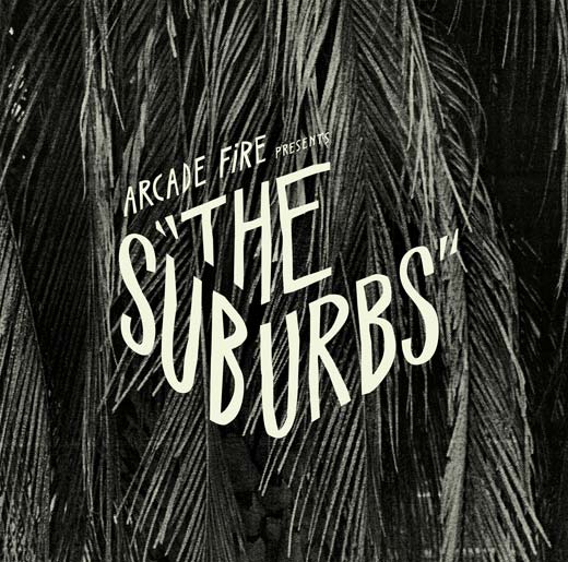
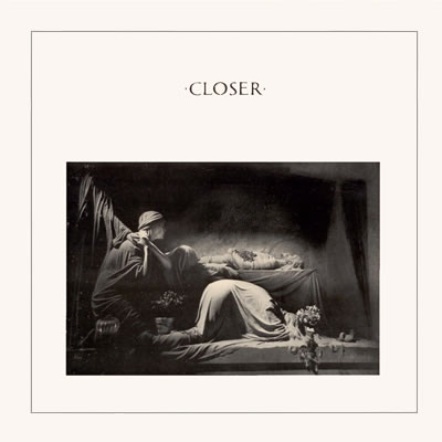
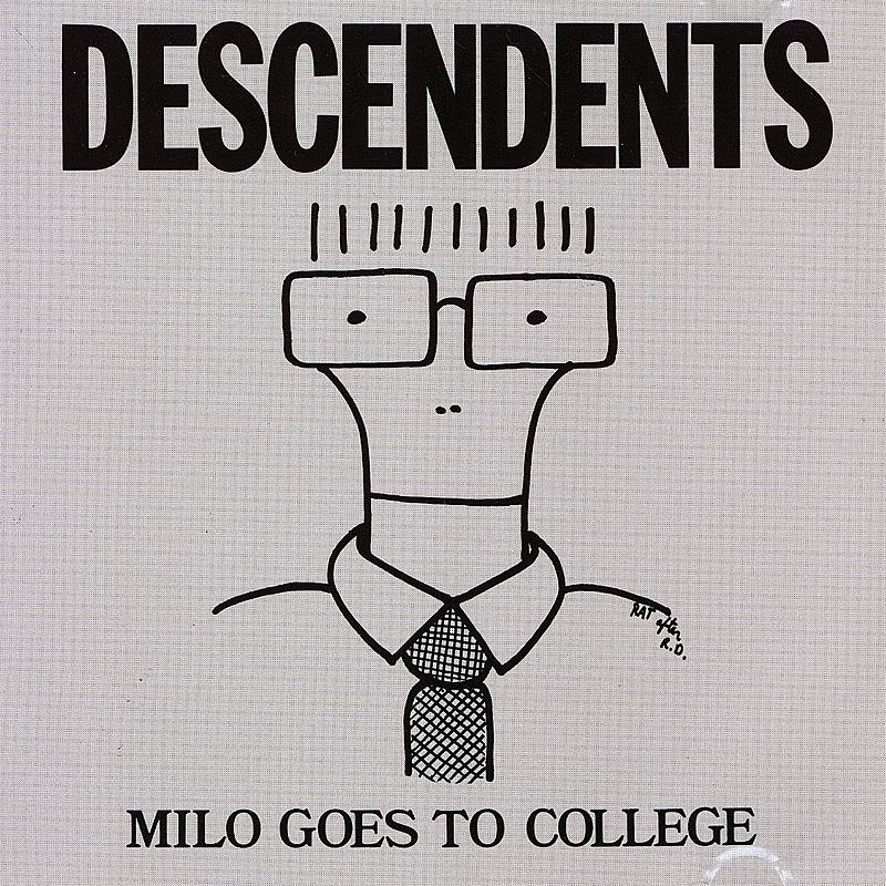
Before having heard a note of the Arcade Fire’s latest album, I knew that I wanted to write about it. The cover art was immediately arresting and I knew it would be a great excuse to discuss hand-drawn fonts. Not that I hadn’t thought about discussing them already: Dinosaur Jr’s Bug, Pavement’s Slanted and Enchanted and The Pixies’ Come On Pilgrim are some old favorites of mine, both in terms of cover and content. Any one of them would have been a proper jumping off place. But, somehow it makes sense to start with this summer’s particular gem.
After having lived with The Suburbs for a couple months, I can firmly place it in my short list of favorite long players of the year, with its themes of isolation and suburban despair and the sleeve-worn musical influences that bubble to the surface. Not, possibly, as immediately accessible as either of Arcade Fire’s previous offerings, my appreciation of this current collection of songs was a slow burn, with a couple of false starts in there. In the end, it was the noise-soaked melodies that won me over, not necessarily the darker ideas of suburban ennui and apocalyptic sprawl.
Continue Reading →


 Editor’s Note: We were thrilled when writer, photographer and all-around badass
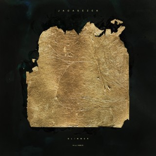


