


Total
Posted on 06/21/2011 by Eric Hurtgen
Rhino Records UK released TOTAL: from Joy Division to New Order on June 6, a collection of both bands’ best-known songs. Linking the two makes sense, as the dark post-punk of Joy Division ended abruptly when leader singer Ian Curtis committed suicide. After the posthumous release of their second album, Closer, the remaining members reformed as the decidedly brighter New Order, enjoying decades-spanning commercial and critical success. TOTAL follows the two bands chronologically, highlighting the musical evolution of both.
It’s always been very hard to separate the music of either band from their sleeve art. Peter Saville, a dominating influence in the world of design, crafted a minimal, highbrow ethic for both bands. Saville returned with longtime collaborator, Howard Wakefield for TOTAL. We recently had the opportunity to speak with Wakefield about TOTAL, typography and working with Peter Saville.
Both Joy Division and New Order are very iconic bands. How do you design for “iconic”?
Carefully… A New Order or Joy Division sleeve is very emotive. We had to do something that respected their iconic status, but not casually raid a previous concept or look. Particularly when designing for both bands, which hadn’t been done before… so this was doubly difficult.
For TOTAL, we had to look back to some degree, as it was a compilation and it was merging a memory of both bands. We felt that it should look more New Order than Joy Division because of the time span of both bands and their musical output — this compilation was a journey from the 3 years of Joy Division to the 30 years of New Order after all.
Speaking of iconic, you’ve collaborated with Peter Saville on various projects. How has this partnership evolved over the years? What is your favorite project that you’ve worked on together?
I started working with Peter when I left art college and began by watching, listening and learning. As time went by, with experience and confidence, I got involved more and more creatively. Peter notoriously worked very late and I had to be able to get on during the day, otherwise I would have just spent all day hanging around waiting. The level of attention to detail that Peter expects is second nature to me now, so we will talk about an idea and then I will visualise what we have discussed. Sometimes my interpretation is not what Peter intends, but more often then not I will create something he loves, which was the case for the Somerset House ice rink. He did a quick sketch of some lines going around a box which represented the shape of the building.
My favourite project is a very difficult question — I have worked with some great bands including Pulp (working directly with Jarvis Cocker, which was an honour). And it was while working on This is Hardcore where I introduced the Smart Blur effect to make the photos feel like paintings and add the element of un-reality the photos needed. The design for Suede’s Head Music stands out where we really went wild in Photoshop. Other amazing clients include the identity for Givenchy and graphically re-organising the whole of EMI Group, but I have to say so far my proudest moment was being the first designer to be credited along side Peter on a New Order sleeve — Ruined In a Day in 1993.

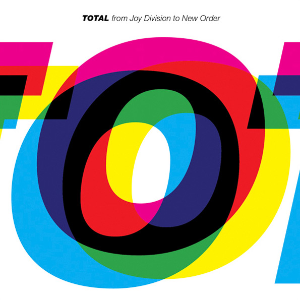
What led you to create a completely typographic cover for TOTAL?
There was a more graphic proposal, based on a memory of Closer (which proved too costly), so I suggested concentrating on the title. After all, this is quite a commercial release and I saw a great analogy with the washing up powder inspired ‘Run 2.’ We decided to treat the design as very commercial too. The idea was to have a very large title on the cover (which is not what we would normally do for either band) and out-of-register as if it was printed too quickly to get it to the stores ‘now, now, now.’ The band liked the mis-aligned look but they thought there was too much white space. However the title was already as large as it could go. So I thought, ok if they want less white space I will give them less white space and sacrificed the whole title in favour of my favourite part and zoomed into the letter ‘O’ — it was the sexiest part anyway.

You chose Helvetica Heavy Italic as the type for the primary “illustration.” Why that particular font?
We looked back over all the previous New Order sleeves to determine which font could sum the look of New Order. Was there a style that we remembered before all the others? Most New Order albums including the first one I worked on, Republic, used a different font, so it wasn’t straight forward, but Technique stood out as the most iconic in our memories. Yet New Order itself was not set in Helvetica — Technique was. But it was that ‘title’ and that ‘setting’ that was ‘New Order’ for us, and it was that ‘look’ that become iconic and the most memorable. To add the Joy Division factor, we used it in uppercase which was set for most of the Joy Division sleeves — again how we remember Joy Division.

What’s next? Can you share any other current projects that you are passionate about?
We are working on an official Joy Division website and e-store. I am also talking to some new bands — Peter doesn’t really work in the music industry anymore apart from New Order and Joy Division, but I’m loving it and at the moment, that is what I want to do. We had a meeting with a new band last month and their management were delighted to say that it was so refreshing to talk concepts rather than simply sticking a band’s name on a photo.
For projects that I am passionate — honesty is always at the heart of what we do and the ones where my design makes an impact are really rewarding. We have recently completed the identity for a political party in Denmark where our designs have changed the perception of the party by ‘breaking the mould’ of political design and as a result the design has played a key role in doubling their share of the vote.
We also created an identity for French record label Citizen — it is their 10th anniversary this year and they wanted a logo that that they could identify with. I used a really quirky font called Nova by LUX in San Francisco which I felt was a great analogy for their techno music. Sometimes a quirky font that can be quite difficult to use has use and I was so pleased to join the two together.
Do you have a favorite album cover of all time?
I don’t have a favourite, but surprisingly one that left an impression is Make it Big by Wham! which my sister Rachel owned when we were teenagers. Peter transformed a boy band into something very sophisticated and indicated where George was going. I remember vividly picking up the sleeve and knowing this was Peter’s design, turning over and seeing the hallowed words ‘Design by PSA.’ And it was the realisation that here was a person, who designed for my 5 favourite bands at the time — New Order, Joy Division, OMD, Roxy Music and Ultravox — if he used design to transform a perception, he was the person I had to learn from.

What Others Are Saying