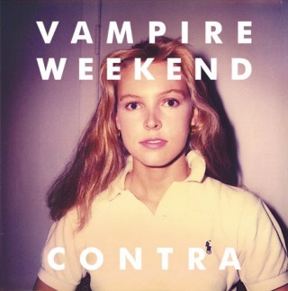
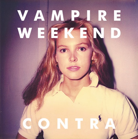
i’m not a font policeperson, nor do i aspire to be one. but i do agree with them on one thing: ikea’s choice to move from futura to verdana was a bad one. i remember my first awkward photoshop sessions in the nineties—i’d always use futura in all my creations—it was the coolest looking font that came bundled with my pc at the time. as a result, i have this soft spot in my heart for the bold sans-serif.
Continue Reading →

Ikea, your recent move from Futura to Verdana has caused quite a ruckus amongst certain folks that I can only refer to as The Font Police. You should take a lesson from one of the greatest live rock’n’roll bands ever… The Who. They know how to rock some Futura, as evident on their 1978 album Who Are You (the last record with drummer Keith Moon).

You think that album cover would work in Verdana? (Ignoring for a moment that Verdana was designed by Matthew Carter for Microsoft and released in 1996, with hand-hinting done by Thomas Rickner).

We both know Roger Daltry wouldn’t stand for it.

Front cover photo: Terry O’Neil. Back cover photo: Martyn Goddard. Design: Bill Smith.