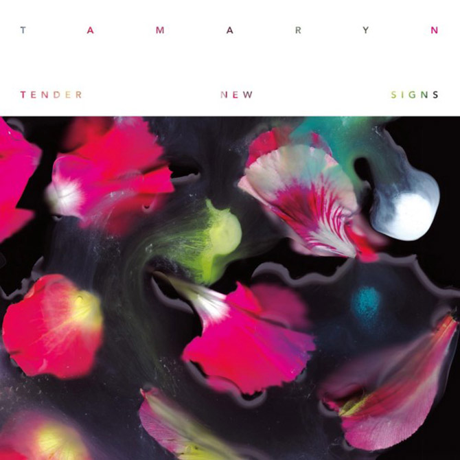
Classically beautiful and hauntingly melancholic, Jacaszek’s Glimmer exists in that thin space between orchestral and ambient. Replete with harpsichord and clarinet, the Eastern European sensibilities of the Baroque period twist around the sounds of bitcrushed digital noise to create a delicate tension that makes the record compelling and beautiful.

The sleeve reflects Jacaszek’s moody atmospherics perfectly. Executed by Michael Cina—founder of the design studio, Cina Associates—the cover features a broken, fragile gold leaf ellipse set against a dark background. Both earthy and sophisticated, the contrast matches the simple elegance of the music. Recently, Rock That Font caught up with Michael Cina to discuss the cover design, naive craftsmanship and the value of not knowing your limits.

Continue Reading →

It’s rare these days that an album grips me so completely as Bon Iver’s recent eponymous release. It’s an album in that classical, 60′s-era sense — every song is necessary and complete. Songwriter Justin Vernon has created a unified work that both touches on and transcends folk, soul, rock and chamber music. Maybe it’s Vernon’s work with Kanye West, maybe it’s his preoccupation with Bruce Hornsby, but Bon Iver, Bon Iver aims for the grand statement and wins; all the while managing to maintain that intimate scale that Vernon created on his debut, For Emma.
Continue Reading →

Dean Wareham, the frontman for Luna, spent well over a decade perfecting his craft before he recorded the dream pop masterpiece Penthouse. A New-Zealand-born New Yorker, Wareham began his career in earnest with the seminal Galaxie 500, a three-piece that predated and prefigured the shoegaze movement. But Wareham had ambitions beyond their modest, but enviable, success. Luna was his next project and three records in, he and his bandmates hit creative gold with their paean to New York and moody nightlife, though not much gold apparently in the way of record sales. Regardless, it was a critical success and Rolling Stone put it in their top 100 albums of the 90s.
Continue Reading →

Rhino Records UK released TOTAL: from Joy Division to New Order on June 6, a collection of both bands’ best-known songs. Linking the two makes sense, as the dark post-punk of Joy Division ended abruptly when leader singer Ian Curtis committed suicide. After the posthumous release of their second album, Closer, the remaining members reformed as the decidedly brighter New Order, enjoying decades-spanning commercial and critical success. TOTAL follows the two bands chronologically, highlighting the musical evolution of both.

It’s always been very hard to separate the music of either band from their sleeve art. Peter Saville, a dominating influence in the world of design, crafted a minimal, highbrow ethic for both bands. Saville returned with longtime collaborator, Howard Wakefield for TOTAL. We recently had the opportunity to speak with Wakefield about TOTAL, typography and working with Peter Saville.
Continue Reading →

Before having heard a note of the Arcade Fire’s latest album, I knew that I wanted to write about it. The cover art was immediately arresting and I knew it would be a great excuse to discuss hand-drawn fonts. Not that I hadn’t thought about discussing them already: Dinosaur Jr’s Bug, Pavement’s Slanted and Enchanted and The Pixies’ Come On Pilgrim are some old favorites of mine, both in terms of cover and content. Any one of them would have been a proper jumping off place. But, somehow it makes sense to start with this summer’s particular gem.

After having lived with The Suburbs for a couple months, I can firmly place it in my short list of favorite long players of the year, with its themes of isolation and suburban despair and the sleeve-worn musical influences that bubble to the surface. Not, possibly, as immediately accessible as either of Arcade Fire’s previous offerings, my appreciation of this current collection of songs was a slow burn, with a couple of false starts in there. In the end, it was the noise-soaked melodies that won me over, not necessarily the darker ideas of suburban ennui and apocalyptic sprawl.
Continue Reading →