


Tender New Signs
Posted on 10/29/2012 by Eric Hurtgen
Tender New Signs is the welcome follow-up record to Tamaryn’s 2010 release, The Waves. Using most of the 80’s Creation Records’ roster as a jumping-off point, New Zealand born vocalist Tamaryn and collaborator Rex John Shelverton make the kind of hazy left-of-center pop music that should be on big, expensive radio stations but is not. This is a shame because you should be able to be driving down a big city boulevard and randomly hear songs like “While You’re Sleeping, I’m Dreaming” on your car stereo.
The cover was designed by Shaun Durkan, a graphic designer by training as well as the bassist and vocalist for the band Weekend. We had the pleasure of asking Shaun a few questions about his work on the Tamaryn cover, his font choice and collaborating with the artist.
What font did you use on the cover? Any particular reason you used that font beyond the visceral, “I like the way this looks with that?”
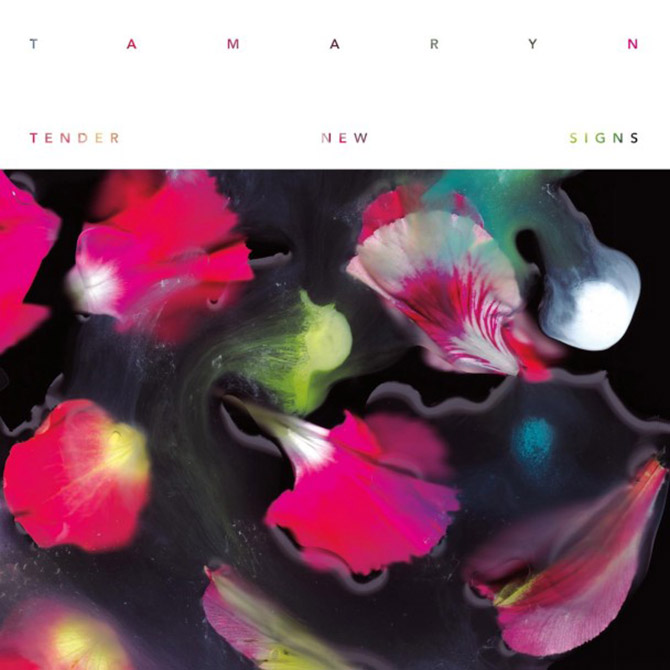
SD: I knew I definitely wanted to use a geometric sans-serif for everything on the record. It was obviously important for the type to match the clean, and classic feel of the imagery. I also needed something with a bit of weight to it in order for the masking effect of the flowers behind the type to really show. Not to mention we did a layer of UV coating on the type and some of the type gets quite small on the back (5pt if I remember correctly).
Personally, Avenir had all the positives of Futura without any of the emotional associations. It felt a bit virginal, which may be naive but in the end it was really a gut decision.
Oh yeah, Avenir is really nice. I read somewhere that Adrian Frutiger, the typographer, was inspired by Futura when he created Avenir. Definitely a solid choice.
You mentioned the flowers. It’s a really bold image. How did that come about? Is it a photograph?
SD: Tamaryn’s lyrics are really centered around natural imagery. Flowers, the ocean, the sky…etc so it made sense to start working with something that complimented the words and also suggested romance and life and death. All the major themes.
The image on the cover and all the digital singles/postcards are variations on flowers and watercolors on a scanner with the lid up in a pitch black room. It was the only way I could manipulate the colors and flowers and preserve that vacuous sense of space. Their sound is so intrinsically about both physical and internal space, the goal was to find a way to illustrate that world.

These images are really nice. I love that you made images for all the digital singles. How much of this project was a collaboration between yourself and the artist? It seems that you were given a pretty wide space to play in.
SD: Thank you. There was a much more extensive back and forth between Tamaryn and I than any project I’ve worked on before. Most of that was because we were friends before we started the project, so we felt comfortable giving each other honest critique and being pretty blunt about what was working and what wasn’t. Tamaryn had a very specific idea of what she wanted the art to look like before I started working, which involved using some photos already taken by a friend. But I knew there was potential for the project to become so much more that I had to keep pushing and pushing to make original work – solely for the record. It was frustrating and stressful at times as she’s very opinionated and I can be pretty hardheaded about my work, but I think we’re both pretty proud of what came of it all.
Yeah, I think that makes for a great project, especially if you have the kind of friendship that can handle that kind of intensity.
How long have you been doing design?
SD: I start designing when I was in middle school I guess. I was in a band and did all the flyers/logo/website stuff. We even had shirts and played mainly teen centers in California. I believe I was working mainly in MSpaint and a very primitive version of Photoshop. Then I attended San Francisco Art Institute for a year studying photo and ultimately transferred to CCA where I majored in Graphic Design.
I feel like being in a band or being into music got most of us into design. It seems like a common theme. Do you have any major influences/heroes when it comes to the design you do?
SD: Influences: Martin Venezky, 23 Envelope, Brian Roettinger, Experimental Jetset, Hort. Generally…a bit of controlled chaos.
Nice. What’s next for you? More music packaging projects?
SD: What’s next for me…I’m about to start on a couple really exciting projects. The artwork for both the new Wax Idols record (via Slumberland Records) and the new No Joy record (Mexican Summer). Both bands are great friends of mine and their new records are pretty damn amazing. Also in the distant future is art for Azar Swan, the new project of members of Religious to Damn.
I suppose I’ll have to start working on the new Weekend LP art also so I’ve got quite a full plate in the next 4 months or so.


What Others Are Saying