


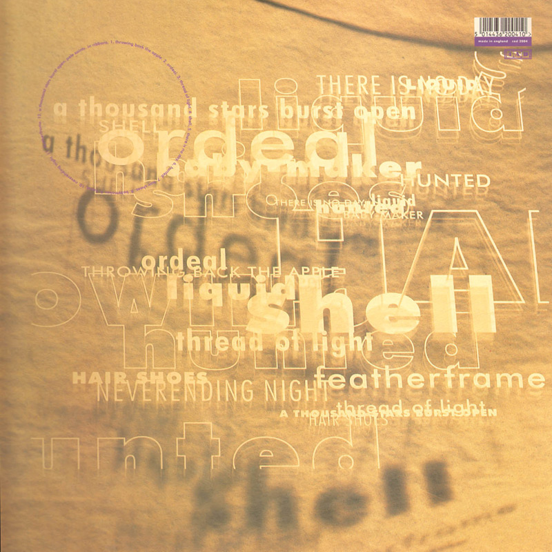
A friend recently asked a funny question: “What song did you listen to right after losing your virginity?” While I really don’t remember, it very well could have been “A Thousand Stars Burst Open” by the always underrated Pale Saints.


A friend recently asked a funny question: “What song did you listen to right after losing your virginity?” While I really don’t remember, it very well could have been “A Thousand Stars Burst Open” by the always underrated Pale Saints.
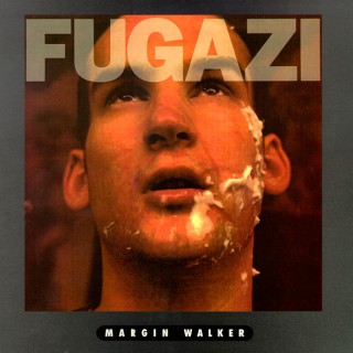
We all hold dear those bands that forever changed us in our formative teen years. For me, one that often comes to mind is Fugazi.
I was 15 years old (and full of all the naive, idealistic, invincible lust of youth) when I first saw them perform. Throw in a guitar for my birthday, a few power chords and some borrowed stage moves from Guy Picciotto… and before I knew it, I was in my own band. I’m just one of thousands who were inspired in this very manner, back when the word “emo” seemed to reference something very different than it does today.
Continue Reading →
i’m not a font policeperson, nor do i aspire to be one. but i do agree with them on one thing: ikea’s choice to move from futura to verdana was a bad one. i remember my first awkward photoshop sessions in the nineties—i’d always use futura in all my creations—it was the coolest looking font that came bundled with my pc at the time. as a result, i have this soft spot in my heart for the bold sans-serif.
Continue Reading →
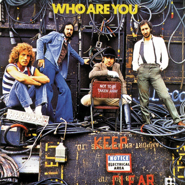
Ikea, your recent move from Futura to Verdana has caused quite a ruckus amongst certain folks that I can only refer to as The Font Police. You should take a lesson from one of the greatest live rock’n’roll bands ever… The Who. They know how to rock some Futura, as evident on their 1978 album Who Are You (the last record with drummer Keith Moon).
You think that album cover would work in Verdana? (Ignoring for a moment that Verdana was designed by Matthew Carter for Microsoft and released in 1996, with hand-hinting done by Thomas Rickner).
We both know Roger Daltry wouldn’t stand for it.
Front cover photo: Terry O’Neil. Back cover photo: Martyn Goddard. Design: Bill Smith.


