Glimmer
Posted on 01/13/2012 by Eric Hurtgen
Classically beautiful and hauntingly melancholic, Jacaszek’s Glimmer exists in that thin space between orchestral and ambient. Replete with harpsichord and clarinet, the Eastern European sensibilities of the Baroque period twist around the sounds of bitcrushed digital noise to create a delicate tension that makes the record compelling and beautiful.
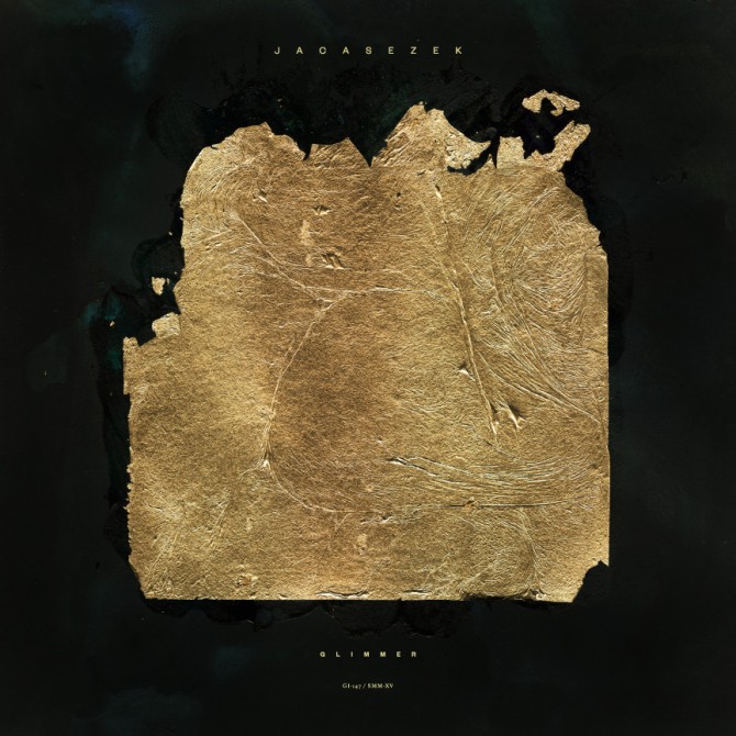
The sleeve reflects Jacaszek’s moody atmospherics perfectly. Executed by Michael Cina—founder of the design studio, Cina Associates—the cover features a broken, fragile gold leaf ellipse set against a dark background. Both earthy and sophisticated, the contrast matches the simple elegance of the music. Recently, Rock That Font caught up with Michael Cina to discuss the cover design, naive craftsmanship and the value of not knowing your limits.
You’re a bit of a renaissance man—you’re an artist, a designer and a typographer—how does that play out when you’re designing for an album cover, where do you start first: with the art or the typography?
Recently I have been thinking about this topic. I feel that design is an exploration of semiotics, the visual language of what all images say (typography included). That is my main guidepost for producing an album cover. I am trying to use album covers as a mode of communication.
A lot of times I start with visual ideas and more often than not, I leave type towards the later part of the process. I can do anywhere from 10 to 100 visual ideas, so by that time, the image becomes a little more elevated in its importance.
The typographic aspect of the project is usually me getting myself out of a corner that I put myself in by not thinking about more about the typographic aspect. I use type sparingly on a lot of covers, but I am always aware of what it is saying.
Recently I started on a cover using typography as the main element. After two hours of working on it I ended up doing a cover with no type on it at all!
So when you started working on the Jacaszek project, were you already thinking about the visual statement as a whole or were you just trying to pick up on some kind of visual imagery that would relate to his brand of postmodern orchestral music?
I am trying to hit a lot of different thoughts and ideas all at once and it is difficult to capture that. The music was finished and I got a copy that I had listened to a couple of times, shortly after that I got the brief on what Michal was thinking when he made the music. The album name was Glimmer and that was the main approach to follow. Four other guides to go by were “golden fabric, glimmering light on the golden surface, wind, and disappearing horizon.” He also wanted something flat with no dimension, he was very specific about this. Some of the descriptions negate themselves so I started thinking about what I would do for a week or so.
My original idea (shown on inner sleeves) was to take some earth and bind it to a canvas so it would have low contrast. I painted everything black and then bound gold leaf to it. The texture of the earth broke the delicate surface of the gold leaf. The final results were photographed over a period of time to get the different light of the day captured against the surface. In the end, I thought it was good, but something was missing. A month passed and I couldn’t put my finger on it.
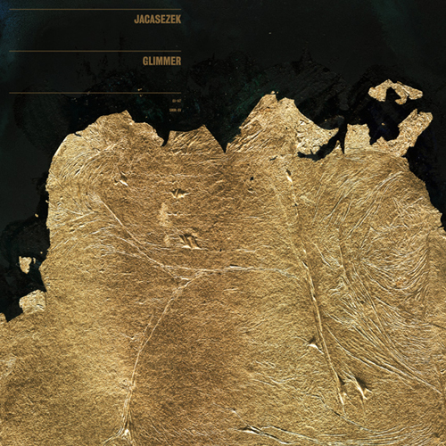
One day I was working on some art and I painted black over two paintings that I had been working on, let them dry, then bound gold leaf to the surface. I never really thought about it before I started, it just felt like what I should do. The final results are what you see on the cover and labels. I think it fits his descriptions quite well accounting for all the considerations there are making an album cover.
I showed the ideas to some of my friends and a couple of responses were “looks like human skin” and “an Arvo Part record” and I thought that was the perfect cross section. When Michal saw these he was very happy with the results as well.
It definitely gives the viewer a perfect visual analogy for the music—beautifully fragile with darkness at the edges. I feel like the best album packaging design does that, it supports the content. I feel like even the typography kind of pushes the viewer toward the music—delicate and subtle. What led you to choosing the sans serif for the cover?
Yeah, the music is very ambitious and serious. I think delicate and subtle applies very well. I feel that is what makes good typography, it adds to what is being said through the design and text. I try not to “over design” or clutter the work with meaningless noise. If you are really saying something, you have to figure out how to say it. I prefer the straight-no-chaser route.
I used Founders Grotesque on this cover. It is a typeface that Sam Valenti and I chose at the beginning of 2011. We felt it was unique enough to embody what we were seeing for the year. What I like is that Founders has a real light weight and odd proportions. The uppercase C is a little too illegible for my tastes but besides that, I love it. It still captures a bit of that naive craftsmanship that I am lead to.
Founders fit perfect into the Jacaszek cover, probably my best use of it to date. I tried some different and bolder approaches but they didn’t really work out too well. I worked on around 50 other type layouts before coming to this. It really matches how I picture the music sounding.
You said that you’re lead to “naive craftmanship” in typography, which I think is great. You’re a serious typographer but you seem really serious about the art and the design too. Do you have one aspect of what you do that you’re more drawn to or do all three kind of support each other?
I think to make wonderful things, you have to be naive to a certain aspect. I think the reality of any project can be overwhelming at times. The dreamers, the people who don’t know their limits, are often the ones who succeed. To get into typography, there is a LARGE learning gap and it is like that with a lot of things.
In the end, all three support each other to me. I have modeled my career around this model, it is not for most people. To me, it is somewhat seamless at times and other times the furthest from that. Right now I am working on a rebrand for a cable company, a rebrand for a sports cable network, and some font work for a sports network. On the side I am doing a little painting, designing everything for a documentary (title through poster), three cd covers, flying to NYC to do a large painting, rebranding/website for a travel company, working on a couple of start ups, just handed off an article for Creative review, and finishing up a font. I also have a blog, thenewgraphic.com that I update pretty regularly. So yeah, it is a juggling act. Of course not all these things are at once but they are all active. I want more work right now too.
So what’s next for you? What dreams are on the distant horizon that you’re reaching for?
My main goal is to do bigger and better work, all around. Really push/stretch myself further in new ways. To do that I need some regular clients that want to do great work together. This would seem like an easy task, but it is not. A lot of designers go under the notion that if they had a client like Ghostly (or whomever) they could do great work, but that is not true. You can do great (or horrible) work for anyone. It just takes trust, faith (in both parties), and a drive to push beyond the mundane.
Both corporations and clients seem to be scared or they have a lack of trust of designers, but it is the companies that take that leap of faith are the ones that reap the rewards. Ghostly could want to do mindless and trendy covers but they invested in art and design. Older brands like Braun, Olivetti, Container Corporation, Geigy, etc took that leap of faith by trusting design to work for them and it did. You see this today with Apple, Nike, and a couple of others, but it is not quite the same.
I am trying to find someone to represent me and my work. That has been a big dream of mine. I would like to be admitted into the AGI. It would be great to speak at the college I dropped out of. I would like to have a solo show at a large gallery next year. My main goal is to get another larger client though. Any takers?


Be the first to leave a comment