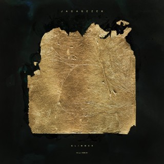
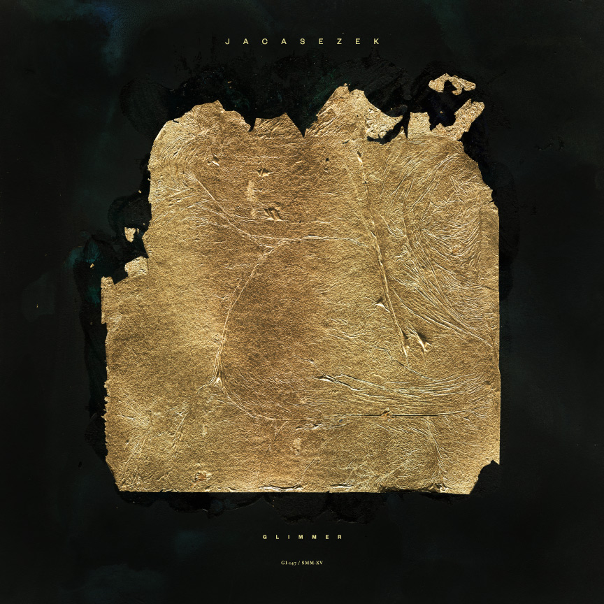
Classically beautiful and hauntingly melancholic, Jacaszek’s Glimmer exists in that thin space between orchestral and ambient. Replete with harpsichord and clarinet, the Eastern European sensibilities of the Baroque period twist around the sounds of bitcrushed digital noise to create a delicate tension that makes the record compelling and beautiful.

The sleeve reflects Jacaszek’s moody atmospherics perfectly. Executed by Michael Cina—founder of the design studio, Cina Associates—the cover features a broken, fragile gold leaf ellipse set against a dark background. Both earthy and sophisticated, the contrast matches the simple elegance of the music. Recently, Rock That Font caught up with Michael Cina to discuss the cover design, naive craftsmanship and the value of not knowing your limits.

Continue Reading →

Rhino Records UK released TOTAL: from Joy Division to New Order on June 6, a collection of both bands’ best-known songs. Linking the two makes sense, as the dark post-punk of Joy Division ended abruptly when leader singer Ian Curtis committed suicide. After the posthumous release of their second album, Closer, the remaining members reformed as the decidedly brighter New Order, enjoying decades-spanning commercial and critical success. TOTAL follows the two bands chronologically, highlighting the musical evolution of both.

It’s always been very hard to separate the music of either band from their sleeve art. Peter Saville, a dominating influence in the world of design, crafted a minimal, highbrow ethic for both bands. Saville returned with longtime collaborator, Howard Wakefield for TOTAL. We recently had the opportunity to speak with Wakefield about TOTAL, typography and working with Peter Saville.
Continue Reading →

This album pretty much changed my life. Shortly before the beginning of my sophomore year in high school, my friend Jason came over to spend the night at my house. We were both skaters, we both loved music, and our friendship was really starting to click.

Aside from being a much better skater, Jason seemed to know more about, well, pretty much everything. In particular, dude put me on to a lot of music. That night, he brought over three cassettes for me to copy, A Tribe Called Quest’s People’s Instinctive Travels … and two fIREHOSE tapes, if’n and Ragin’, Full-On.
Continue Reading →

David Shaw Editor’s Note: We were more than pleasantly surprised when David Shaw contacted us to share his Belm Blog post on Joy Division’s Closer. Inspired by Eric’s post on Unknown Pleasures and a little Joy Division obsession, David really knocks it out of the park — and it’s our pleasure to re-publish it here. When not rocking that font, David is a music critic and amateur graphic designer. He blogs about music and design, but mostly about cooking.

As synchronicity would have it, I have been reading and watching a lot of media about Joy Division; Factory, their record label; and Peter Saville, Factory’s first graphic designer. Saville designed Unknown Pleasures, and somehow managed to follow up that feat a year later with another Joy Division icon, the cover of Closer. (The title is pronounced with a soft “s,” as in “more intimate” or “nearer to a goal,” not with a hard “z” as in “one who closes or concludes.” Pedantry, yes, but mispronouncing the name of this album will not put you in my good graces.)

Continue Reading →

The way I see it, you may as well get the icons out of the way right at the beginning. And this album is chock full of icons. From Peter Saville‘s minimalist package design to the frontman Ian Curtis’ enigmatic presence, Joy Division’s debut album Unknown Pleasures pretty much has it going on. And let’s face it, is there anything cooler than the white illustration on the front? Take that, mix in the single “Love Will Tear Us Apart,” and the whole thing kind of exists in a haze of unapproachable cool.
Continue Reading →