


Ragin’, Full-On
Posted on 06/21/2010 by Les Jacobs
This album pretty much changed my life. Shortly before the beginning of my sophomore year in high school, my friend Jason came over to spend the night at my house. We were both skaters, we both loved music, and our friendship was really starting to click.
Aside from being a much better skater, Jason seemed to know more about, well, pretty much everything. In particular, dude put me on to a lot of music. That night, he brought over three cassettes for me to copy, A Tribe Called Quest’s People’s Instinctive Travels … and two fIREHOSE tapes, if’n and Ragin’, Full-On.
I became obsessed with those albums. That obsession fathered a split infatuation with Hip-Hop and independent rock music that lives with me to this day.
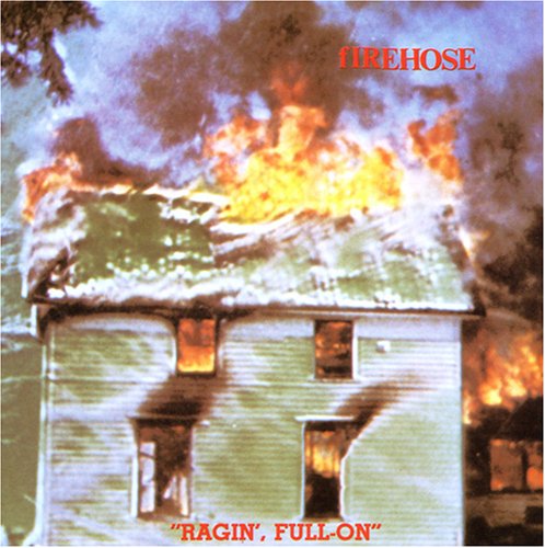
I didn’t have much of a budget in those days, so acquiring music mostly involved raiding friends’ tape collections and dubbing as much shit as I could. I tried to label all these tapes by copying the bands’ names onto the tape cover spines in the same styles as they appeared on the original covers. In the case of fIREHOSE, I reproduced the classic shapes of its Times New Roman Bold letters. The fIREHOSE logo is so simple, but I love it so much, with that rebellious lowercase “f” butting against the bold, workman-like letters of what seems like the default serif face of my generation. That simple play on capitalization turned otherwise common text into a logo that became an icon.
The design of Times New Roman is historically credited to the work of London Times illustrator/designer Victor Lardent under the direction of Stanley Morison for Monotype in 1931. The official story is that Morison, a critic of the typography of the Times, was commissioned by the newspaper to come up with a better, more modern and readable typeface for the paper to use. Morison is said to have based his sketches of the new typeface on Plantin. Lardent took the sketches and Morison’s guidance and used his draftsman skills to make them a reality.
Type historian Mike Parker, who worked as the Director of Typography at Mergenthaler Linotype before teaming with Matthew Carter to found Bitstream, calls this history into question.
Parker insists that Times New Roman was actually born from the hands of William Starling Burgess, a famous yacht and airplane builder who not-so-famously had a side interest in designing type. According to Parker, Burgess had drawn a face for Lanston Monotype in 1904 that ended up sitting in obscurity in the company’s archives for years under the generic name Number 54. Those sketches would eventually be acquired by Morison, who used them as the foundation for Times New Roman.
You can read the details in this fascinating story published last year in the Financial Times. Here’s an excerpt:
“Parker says that in 1921 Lanston Monotype tried unsuccessfully to sell the Number 54 font to a fledgling news magazine called Time. Sometime after that, Burgess’s drawings fell into the hands of Stanley Morison, a type consultant at the Monotype Corporation in Britain, by way of Frank Hinman Pierpont, an American who managed that company’s factory in Surrey and who made a career out of reviving old fonts. … Precisely how Pierpont came upon them, Parker cannot say, but he stands by the theory. ‘Morison knew no bounds,’ says Parker, who has numerous anecdotes about their many encounters that paint a picture of a cunning and devious man. Morison never took credit for designing the font himself, but claims only to have ‘excogitated’ it. Years after its release, [Morison] wrote of the only font that he is credited with designing: ‘It has the merit of not looking as if it had been designed by somebody in particular.'”
Times New Roman’s original designer may forever remain the subject of controversy, but the typeface’s ubiquity is undisputed. As noted on the London Times‘ “infrequently asked questions” page: “Times New Roman became the default font in Microsoft Word, which at least half a billion people use worldwide. It is now the most commonly used typeface in the world.”
That commonness plays well with the working class ethos and lack of pretension that I loved so much about fIREHOSE. The band evolved from the legendary punk band the Minutemen, and in doing so brought along Minutemen’s use of Times New Roman and an aesthetic that rebelled against the stylized self-importance of arena rock.
Of course, fIREHOSE’s music was anything but common. The band built upon Minutemen’s melding of hardcore punk, funk and jazz and expanded the sound to incorporate more traditional rock arrangements. Ragin’, Full-On (fIREHOSE’s debut record in the emotional wake of the death of the Minutemen’s D. Boon) showcases this sound from start to finish. Almost 25 years after its 1986 release, the album still has all the raw and earnest energy that knocked me off my feet when I first heard it.
The title of the album is set in the slab-serif Memphis, designed by Dr. Rudolf Wolf for the D. Stempel AG type foundry in 1930. It sits stoic and firm in its irony beneath the raging flames above.
This record opened doors for me. I fell in love with the DIY ethic that powered the music and that led me to the underground world of independent record stores, mail-order catalogs and wildly diverse sounds that shifted my whole musical paradigm.
And, damned if it didn’t make me want to skate that much harder. After all, skateboarding is what brought fIREHOSE to Jason’s (and thus my) attention in the first place. The lead track on Ragin’, Full-On, “Brave Captain,” is the soundtrack to one of the most storied skate video clips of all time, Natas’ legendary segment in Santa Cruz’s Streets On Fire. To this day, every time I hear “Brave Captain” I think of Natas spinning on that fire hydrant and rail-sliding that truck’s roll bar.
What Others Are Saying