Linda Park Editor’s Note: We were thrilled when writer, photographer and all-around badass Linda Park accepted our invite to be a guest contributor. She’s worked in the music industry for longer than she’ll allow us to mention, tour managing famous bands and working on events such as SXSW. But mostly, she “tells it like it is” like no one else. Catch more of her talents and grains of wisdom at Afraid of the Park and Into the Great Wide Open.

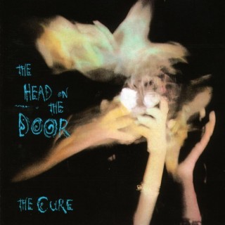
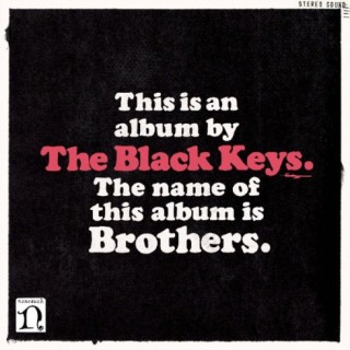
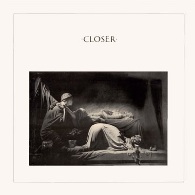
When Shawn asked me to do a post for Rock That Font, well of course I was excited because anyone asking me to write anything is pretty groovy and sure, I like music and design. I am not, however, a super smart font nerd so it became ponderous, what record to discuss.

Continue Reading →

David Shaw Editor’s Note: We were more than pleasantly surprised when David Shaw contacted us to share his Belm Blog post on Joy Division’s Closer. Inspired by Eric’s post on Unknown Pleasures and a little Joy Division obsession, David really knocks it out of the park — and it’s our pleasure to re-publish it here. When not rocking that font, David is a music critic and amateur graphic designer. He blogs about music and design, but mostly about cooking.

As synchronicity would have it, I have been reading and watching a lot of media about Joy Division; Factory, their record label; and Peter Saville, Factory’s first graphic designer. Saville designed Unknown Pleasures, and somehow managed to follow up that feat a year later with another Joy Division icon, the cover of Closer. (The title is pronounced with a soft “s,” as in “more intimate” or “nearer to a goal,” not with a hard “z” as in “one who closes or concludes.” Pedantry, yes, but mispronouncing the name of this album will not put you in my good graces.)

Continue Reading →

Geoff Peveto Editor’s Note: We are very honored to have Geoff Peveto of The Decoder Ring Design Concern as our very first guest contributor. In addition to his duties as president of Decoder Prints, he currently serves as President of the American Poster Institute and runs the international Flatstock poster convention — even curating the forthcoming Rock Paper Show book about Flatstock. Recently he decided sleep was overrated and opened Frank, a sorely-needed artisan porkhouse in Austin specializing in hot dogs and cold beer. This is where we would normally insert a bunch of legalese about Geoff’s views and commentary not representing Rock That Font and what have you, but our lawyer is on vacation.

So Les posted an excellent entry about Cooper Black… it’s so good I almost wrote Shawn to tell him I missed my window to contribute. You see when Shawn asked me to be a part of RTF, the first LP design that came to mind wasn’t anything from the thousands of records and CDs I have. It happened to be a new release that wasn’t even out yet. However, the art (leaked or otherwise) was online and it was typeset with Cooper Black. And man I fucking LOVE Cooper Black.
Continue Reading →