


Brothers
Posted on 05/27/2010 by Geoff Peveto
 Editor’s Note: We are very honored to have Geoff Peveto of The Decoder Ring Design Concern as our very first guest contributor. In addition to his duties as president of Decoder Prints, he currently serves as President of the American Poster Institute and runs the international Flatstock poster convention — even curating the forthcoming Rock Paper Show book about Flatstock. Recently he decided sleep was overrated and opened Frank, a sorely-needed artisan porkhouse in Austin specializing in hot dogs and cold beer. This is where we would normally insert a bunch of legalese about Geoff’s views and commentary not representing Rock That Font and what have you, but our lawyer is on vacation.
So Les posted an excellent entry about Cooper Black… it’s so good I almost wrote Shawn to tell him I missed my window to contribute. You see when Shawn asked me to be a part of RTF, the first LP design that came to mind wasn’t anything from the thousands of records and CDs I have. It happened to be a new release that wasn’t even out yet. However, the art (leaked or otherwise) was online and it was typeset with Cooper Black. And man I fucking LOVE Cooper Black.
Matt Lane Harris of Standard Deluxe used it on one of my favorite shirts, Cheshire Dave’s “Behind The Typeface” is arguably the funniest thing ever made about type, and who doesn’t love a Tootsie Roll?
Oddly enough, I’ve never really used Cooper Black in any of my own work. It tagged along in a poster I made simply by being on a Cat’s Cradle shirt worn by Casey Burns. Casey’s former band, The Nein, got an opening slot for The Fall at The Cradle so I told him I’d make a poster for the show using a photo I took. I added our poster credit to the image and that is the one time I’ve actually used it.
But I digress. This post is about the new LP put out by Ohio’s The Black Keys. I will confess until I saw the art I didn’t give a shit about The Black Keys. In fact the only album I have is 2003’s Thickfreakness and it’s never played. Now if you are a Black Keys fan you must think I’m a retard. Well, you might be right in that conclusion, but you can blame my indifference on The Arcade Fire. You see back in 2004 when Arcade Fire were tearing up venues behind their opus “Funeral,” The Black Keys had the misfortune of getting paired with them for an Austin City Limits after-show. As good as The Black Keys may have been they didn’t stand a chance against Arcade Fire at the peak of their touring prowess. So I completely lost interest in them before they had a chance.
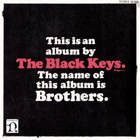
I did continue to notice their art work which is done by drummer Patrick Carney’s brother, Michael. His stuff is hit or miss with me but Attack and Release did catch my eye. On Brothers he used Cooper Black perfectly. It’s such a bold typeface that it doesn’t need anything else around it and that’s exactly how Michael treated it. White on black with a touch of red. The type has been xeroxed a little which I always enjoy seeing. The subtle placement of “stereo” up in the right corner is also a nice touch. The only fault I have is the Nonesuch logo being on the front. But that’s just me and it was probably demanded by some clown at the label.
I can’t really comment on how different this album is from previous releases because I haven’t listened to them. Although as a singular platter it’s pretty dang good. It still has the dirty blues that I remembered from the little attention I gave them at the show six years ago. There is a really nice, soulful nod to traditional R&B and more depth than I ever gave them credit for.
The Black Keys can thank Cooper Black for re-introducing me to their tunes. Brothers is a proper musical jam that I would possibly never have heard — had it not been for that sweet typeface.
What Others Are Saying