


Stakes Is High
Posted on 05/02/2010 by Les Jacobs
It’s very difficult for me to separate Cooper Black from my childhood.
I will confess to you all now, I was a huge Garfield fan. Huge. I’m talking 1978 original Garfield huge. I collected all the books. For years, I begged each Christmas for the new Garfield calendar, my most anticipated gift. I cursed Mondays and made lasagna my favorite food.
This went on for a long, long time. Much too long, honestly. Even to this day, I take a few moments every June 19 to acknowledge his birthday, a loving salute from one sardonic young Gemini to another.
I drew Garfield on everything. I wanted to create a spitting image of Jim Davis’ drawings in my own hand. But I didn’t just draw the character. I mimicked his name, too, in those famous, fat Cooper Black letters that came to define his brand. I loved those letters. They were so fun to draw with their thick, bubbly strokes and all those delicious curves. I don’t think it’s a stretch to say that my love for letterforms began with Cooper Black on the cover of all those Garfield books.
Ironically, that may have ruined me for Cooper Black as a grown up. I could never shake the notion that it was a childish font. As a budding high school typography nerd, I categorized all the fonts I could access from my school computers not by their traditional typographic characteristics, but by my uninformed perception of sophistication. I separated the wheat of grown up fonts that could be taken seriously from the chaff of cheesy and childish display faces that I thought were beneath me. I wanted to put away my childish things.
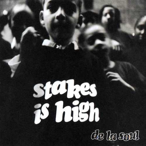
I don’t think I seriously considered Cooper Black again until De La Soul’s Stakes Is High album came out. The cover was designed by Runner Collective‘s Michelle Willems, who at the time was art director for Tommy Boy Records. It features Cooper Black Italic letters jumbled together and bouncing carefree, baseline be damned.
The original version of Cooper Black was the creation of Oz Cooper for the Barnhart Brothers & Spindler Type Foundry in 1921. Cooper, who studied lettering under the legendary Frederic Goudy, was asked to design a typeface based on his own lettering. That face, originally called Cooper, would become Cooper Oldstyle and was released in 1916.
Taking the display flourishes a bolder step forward:
A heavyweight version called Cooper Black was designed next, originally as a 120-point font. Called by designer [sic] as a font “for far-sighted printers with near-sighted customers,” it was hated by conservative typographers, but was popular among graphic designers, to the point that the foundry had problem [sic] of making enough fonts. (excerpted from Cooper’s wiki page)
The italic version hit the scene in 1924, distinct from its roman progenitor not only for its oblique axis, but for the use of alternate shapes for a handful of its letters, most notably the a, f, k, v, w, x and y:

Those alternate forms play well on the Stakes Is High cover, the rounder “a” and “k” adding a feel of youth to the playful arrangement that juxtaposes nicely with Eric Johnson‘s picture of school kids. Obviously, the link between childhood and Cooper Black isn’t unique to me.
But what I love about this cover is how the black and white photo and the clean layout frame the festive type with a gravity and maturity that is at the core of the album’s message. Stakes Is High is unabashedly a grown folks rap record. It was a determined effort by De La to push the discourse in rap to a higher level, while at the same time pushing away from the lighter, less serious roots for which they had always been known.
Cooper Black Italic symbolizes the youth who are the stakes in De La’s effort to influence Hip-Hop’s trajectory. The boldness and crispness of the letters also give the cover a seriousness tied to the traditional roots of the letterforms, especially contrasted against the flashy, over-the-top styles of many Hip-Hop covers of that era. Willems’ cover design manages to bridge the sobriety of De La’s message with the lightness and innocence of children, and in so doing, she managed to use what I had wrongfully considered a childish typeface in a very grown up way.
Cooper himself was known for his whimsy as well as his skill at crafting letterforms. So it speaks to the versatility of his designs that his letters can so easily represent childhood and maturity all in the same strokes.
Pingback: Just my type: how Cooper Black became 2017's most fashionable font | Fashion - Alex Poucher