


Yankee Hotel Foxtrot
Posted on 05/01/2010 by Eric Hurtgen
Like your favorite bar band, we occasionally take requests. This one goes out to Benjamin Sutton at The L Magazine.
Wilco’sYankee Hotel Foxtrot is kind of the OK Computer of the alt-country set. The ambitious record is sprawling and adventurous — and everyone except Wilco’s record label agreed that the album was an instant classic. If alt-country is a genre, then Jeff Tweedy and company way transcended it. And the general public rewarded them for it — the album went gold, far surpassing anyone’s expectations.
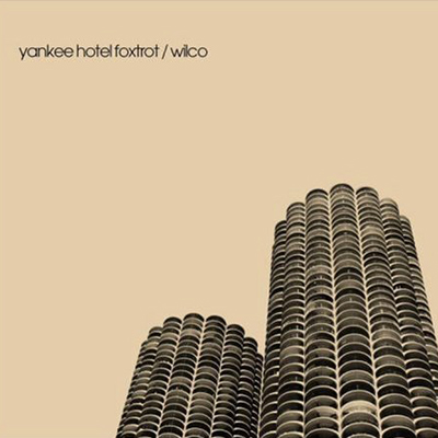
Like the sonic qualities of the music itself, the design was left of of center for a quasi-country act (though Wilco had a track record of arresting images since their first studio album, A.M.). A gorgeously minimal piece of design, the cover featured a photograph of Chicago’s Marina City buildings. The complex was supposed to be a “city within a city,” kind of a one-stop shop for living, playing and working — a perfect compliment for an album as diverse as Yankee Hotel Foxtrot. The typography is similarly perfect: the modern classic ITC Avant Garde Gothic, designed by Herb Lubalin and Tom Carnase (a font based on Lubalin’s design for Avant Garde Magazine).
The best I can tell, the cover uses the book weight of the font and looks to be kerned in pretty significantly. for those of you new to the game, kerning is more or less the act of reducing the space between letters. Usually it’s used to balance the white space proportionally so that a word looks “just right.” the word “kerning” comes from back in the day when type was set by hand and it was all cast metal. Kerning is just another word for “corner” and it was a piece of type that allowed for one letter to overlap onto another letter. Anyway, back to Avant Garde. From My Fonts:
ITC Avant Garde Gothic is a geometric sans serif type, that is, the basic shapes were made with a compass and T-square. The design is reminiscent of the work from the 1920s German Bauhaus movement. Its letterforms are built of circles and clean lines and highly effective for headlines and short texts.
Anytime someone namedrops the German Bauhaus movement, it’s pretty much instant hip. Again, a perfect choice for a perfect album.
What Others Are Saying