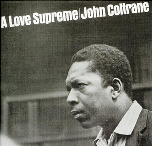
A Love Supreme
Posted on 05/23/2010 by Eric Hurtgen
I discovered John Coltrane about the same time I discovered Jack Kerouac. I’m pretty sure it was the summer between my sophomore and junior year. They seemed to go together seamlessly, Blue Train was my soundtrack to On The Road and it made sense to me, the restless teen I was — looking to, you know, burn like a “fabulous yellow roman candle.” Coltrane’s music always made me think that the saxophonist may have well been one of those kinds of people Kerouac talked about “ambling after”, one of those, “mad to live, mad to talk, mad to be saved…” The intensity of recordings definitely felt that way.
Coltrane had tons of great records, but his masterpiece may be his 1965-release, A Love Supreme. A four-part suite of rollicking hard bop, the album was apparently intended to be a spiritual journey, a kind of expression of gratitude to God. Though it was musically adventurous, it hit a nerve — A Love Supreme sold over 500,000 copies by 1970 (by comparison, most of the other albums he released on Impulse Records sold around 30,000 copies).
The cover art was pure early Impulse, minimal and clean modern — a look and feel pioneered by their art director, Robert Flynn. A Love Supreme hews to the template: a well-composed photograph bleeding full out to the edges with the type set all-caps in one of the three or four fonts they limited themselves to — in this case, Anzeigen Grotesk, which in German loosely translates to “Advertising Sans-Serif.” The font originates from Haas, the Swiss type foundry that brought us classics like Helvetica and Clarendon. Apparently the foundry’s roots goes back centuries, before its namesake, Johann Wilhelm Haas, took over operations sometime after 1718. Then in the twentieth century the foundry changed hands again. From MyFonts:
Stempel purchased an interest in Haas in 1927. Following the end of the Second World War, under leadership of Edouard Hoffmann, Haas produced a group of brilliant typefaces and introduced the Swiss style to the world in the shape of Helvetica. Haas took over Fonderie Olive in 1978. Linotype took complete control of Haas in 1989.
A very cool, condensed piece of typographic work, Anzeigen Grotesk is definitely the right choice. A precursor to Helvetica Insurat or Impact, it has that mid-century quality that begs to be copied: enough swing to be noticed, but not enough to be annoying — pitch perfect for an artist like Coltrane.


What Others Are Saying