


Lifes Rich Pageant
Posted on 05/07/2010 by Eric Hurtgen
There are better R.E.M. albums, but Lifes Rich Pageant is one of my favorites. For me, it sat at the precipice of R.E.M’s catalogue — not as shiny and happy as Out of Time, but not quite as “seminal” as say, Murmur. When the record was released, it was a quite a success for the band. It was their first album to go gold and another step up the ladder that would eventually take them to international acclaim. Still, Lifes Rich Pageant (no apostrophe) was “college rock” at its finest, arty and left-of center, tackling subjects like the environment at a time when most people could care less.
For me, it’s hard to separate the album from my memories of Louisville, KY’s best record store, Ear X-Tacy. The first time I stepped into to the narrow storefront as a ripe middle schooler, I think I may have asked for a Poison album (I can’t really remember) — but the guy behind the counter’s response was something close to, “Don’t listen to that crap. Listen to XTC or R.E.M. or something.” I wasn’t instantly converted, but it was enough to make me question my music sense. Soon enough, I caved and bought R.E.M. on cassette, slowly warming to songs like “Fall On Me” and “The Flowers of Guatemala.”
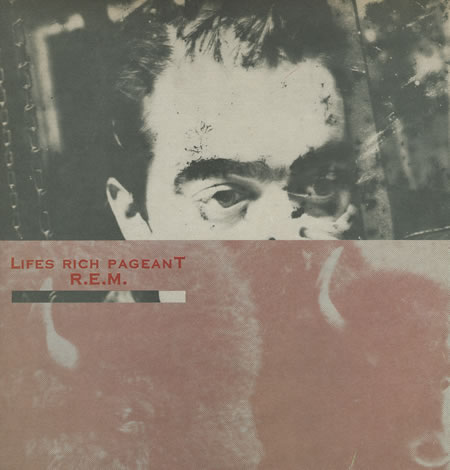
The cover art is vintage Athens, Georgia DIY — half of drummer Bill Berry’s head interrupted by a photo of a pair of bison — very 80’s underground cool. The type was set in the classic Frederic Goudy font, Copperplate Gothic — an ironic choice: Copperplate was a mid-century workhorse, likely to be found on the signage and stationary of lawyers, doctors and bankers, not on rock albums. I don’t know, but I’m guessing that was part of the allure for the former art-school kids: it had no cool pop aesthetic, it was as buttoned down as its Victorian creator. From Linotype:
The original Copperplate Gothic was designed by Frederic W. Goudy in the early 1900s, and the successive weights were drawn by Clarence C. Marder for American Type Founders. It’s a wide, squarish, monotone gothic (sans serif) with the addition of small hairline serifs. These tiny serifs were reminiscent of the edges on letters that were engraved in copperplate, hence the name.
Like R.E.M., Goudy was nothing if not prolific — he produced 122 typefaces during his lifetime and he wrote scores of books. He was even a late bloomer, Goudy didn’t get into the typography game until he was in his forties. His real claim to fame, Goudy Old Style, is apparently one of the most readable typefaces of all time. Copperplate, of course, would never work very well in large chunks, but as type for signs of all kinds, it hit the sweet spot for professionals of the early and mid 1900’s — half modern / half classic, something of a transitional form to the sans-serifs that would come to dominate the latter part of the century.
As for me, even as a kid I wasn’t so hip to the clunky Copperplate. The irony was lost on me. I was way more interested in the heavy Franklin Gothic letterforms that graced so many albums of the time period. That and, of course, the Poison logo.
What Others Are Saying