


Horses
Posted on 04/16/2010 by Les Jacobs
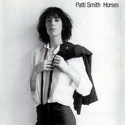
I know that Robert Mapplethorpe‘s famous portrait of a young Patti Smith is the star of this show, but I love how the understated Helvetica Condensed complements the beauty and simplicity of the photo and the raw and glorious music that made this debut such a seminal classic.
The photograph and the type was chosen by celebrated album designer Bob Heimall, who made a name for himself with his design work for The Doors during his stint at Elektra records.
Here’s some background on the Horses cover from a really good interview on Rock Pop Gallery:
In one of his most important decisions, Heimall chose a stark, black and white photograph of Patti Smith with a jacket over her shoulder for her album titled “Horses.” The photo was taken by Robert Mapplethorpe, who was living with Smith at the time. Heimall added the simplest text he could find to keep the photo’s mood intact. The text went on the top third of the album, a standard visibility rule since records were sold in step-down bins at the store.
The lightness of Helvetica Condensed feels at home in the natural light of Mapplethorpe’s image and helps bring Patti and that haunting stare right into your soul.
Be the first to leave a comment