Closer
Posted on 06/12/2010 by David Shaw
 Editor’s Note: We were more than pleasantly surprised when David Shaw contacted us to share his Belm Blog post on Joy Division’s Closer. Inspired by Eric’s post on Unknown Pleasures and a little Joy Division obsession, David really knocks it out of the park — and it’s our pleasure to re-publish it here. When not rocking that font, David is a music critic and amateur graphic designer. He blogs about music and design, but mostly about cooking.
As synchronicity would have it, I have been reading and watching a lot of media about Joy Division; Factory, their record label; and Peter Saville, Factory’s first graphic designer. Saville designed Unknown Pleasures, and somehow managed to follow up that feat a year later with another Joy Division icon, the cover of Closer. (The title is pronounced with a soft “s,” as in “more intimate” or “nearer to a goal,” not with a hard “z” as in “one who closes or concludes.” Pedantry, yes, but mispronouncing the name of this album will not put you in my good graces.)
As with their first album, the band’s name doesn’t appear on the front. They explained to Saville that their name on the cover was self-aggrandizing, not cool. At Factory’s insistence, the briefest of credits appears on the back:
 Peter Saville Associates (PAS) consisted of Saville, Martyn Atkins, Ben Kelly, and a small stable of photographers including Trevor Key. But this particular design — like the album before it — was a brilliant combination of stark type and a riveting image. I can’t do better than the description provided in Matthew Robertson’s Factory Records: The Complete Graphic Album
:
The now-iconic image on the cover of Closer is a photograph by French photographer Bernard-Pierre Wolff. Taken in 1978, at the Staglieno Cemetery in Genoa, it shows a crypt filled with figures in mourning. This Neo-Classicist imagery was complemented with typography based on a 2nd-century Roman alphabet. These elements combine with the textured stock to create a visual experience that mirrors and enhances the music. The imagery on the cover took on greater significance after the suicide of lead singer Ian Curtis, which happened during the manufacturing of the album. Although the concept for the sleeve had been approved by the band before his death, both the label and the designers were accused of exploiting the tragedy when it was decided not to withdraw the artwork.
As a sleeve design, it’s an absolute tour de force. If you purchased the vinyl album in the pre-CD days, you had no choice but to confront the photo, which was just as haunting if you had no knowledge of Curtis’ death. That image, that title, were inseparable from the music; they irreversibly colored your perception of the songs. I can’t imagine that those same tracks, purchased as a digital download without the artwork, could possibly have the same impact on the listener.
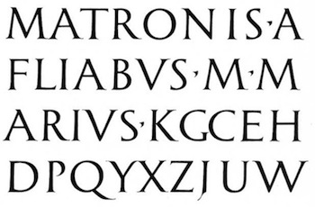
But this isn’t supposed to be about the music, the band, or the photograph, it’s supposed to be about the typography. At first glance, most designers would identify the font as Trajan, a typeface designed by Carol Twombly for Adobe, based on the inscription at the base of Trajan’s Column. Careful inspection will show marked differences between Trajan and the face Saville used.
There’s a clue in the preceding description of the cover: “…typography based on a 2nd-century Roman alphabet.” What is the source of that alphabet? How did Saville find it? I was not the only person interested in that question, in fact, some diligent Googling revealed a discussion thread at Typophile that resolved the mystery:
The original lettering for the ‘Closer’ album was taken from ‘The Development of Writing’ by Hans Eduard Meier, which I believe was first published in the late 1950s and then in the late 1960s. The later reissue no longer shows this piece of lettering, though you can find it here. It’s a very nice piece of work, even though the letter J is a little unconvincing. Perhaps its unfamiliarity makes it more appealing than the ubiquitous Trajan.
Saville then made PMTs [photomechanical transfers] of the lettering and then composed all of the lines. The use of Roman numerals on ‘Closer’ is a give away that Saville could not draw letters (or numerals). In the 1990s Tobias Frere Jones was interested in making a digital revival, but nothing came of it I understand. A digital version was made I believe for the reissues.
 Mystery solved. If a digital version of the font was made for CD reissues, it isn’t publicly available. Dan Gayle, who originated the discussion, has designed a complete font set, but can’t release it due to his inability to obtain the necessary permissions.
Maybe that’s a good thing, insuring that Closer’s typography is as one-of-a-kind as its music.


What Others Are Saying