Diver
Posted on 06/25/2012 by Eric Hurtgen
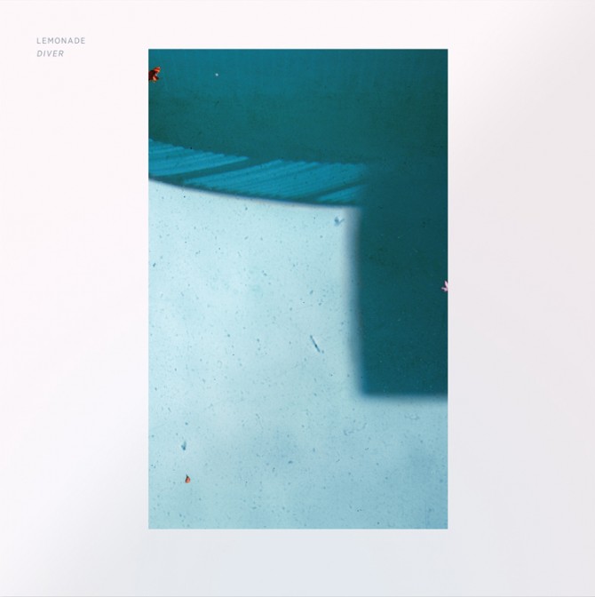
Lemonade’s Diver is pure summery electronic pop, with enough darkness at its edges to keep from falling into saccharine territory. The cover pares well with the overall vibe — clean and minimal while evoking an unplaceable nostalgia. Recently we talked to the designer Tim Saputo about Gotham, photography and how obsessive listening helps music package design.
My first question is the obvious one: what font did you use on the cover?
It’s Gotham Narrow (book weight). Gotham got so abused over the past four or so years but I really love the Narrow family. It’s really strong, yet graceful.
I agree, they did a really good job with it. Can you tell me about the inspiration surrounding the shot choice for the cover?
Before the album was titled “Diver,” Callan (the singer) told me that he really wanted to do something with a woman in a pool at night. Water is a central theme on the record both musically and lyrically so it seemed simple enough. We tried many different photographers in LA, they all did nice work but nothing really worked with what we were going for. We had the record label breathing down our necks and I knew we couldn’t re-shoot it because I wanted to be present to art direct, but I live in New York and it was late February. So, I turned to my friend Josh McNey, who is a very talented photographer with an extensive back catalog.
I was lucky enough to come across an older photo he had taken at an apartment complex in Los Angeles, and it really struck me. I liked that the photo was restrained and somehow complimented the emotional honesty of the record in a very tense way. It was perfect, it’s a very simple image but there is a lot of drama and tension there. It’s not a very clean pool, it has all of these marks at the bottom, and is full of this beautiful debris. The shadow of a balcony adds a slightly ominous feeling, which hints at the record’s darker moments.
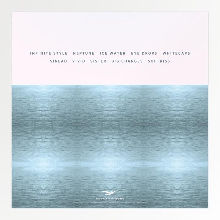
So I spent a long time color correcting so that the blue on the cover, inner sleeve and the back cover, match each other.
You shot the images throughout the booklet and back cover. Any particular influences on your photography?
I don’t consider myself a photographer, I take photos and usually keep them to myself or use them as source material for different projects.
In this case my photography primarily functioned as texture. I made the back cover horizon image from reflecting and repeating a small portion of a photo that I took of Lake Como to create a pattern. I wanted to create an artificially pristine surface to contrast the flawed beauty of the scene on the cover.
Do you have a typical approach to designing album covers or is it different every time? Does it differ from your other client work?
I like to work really closely with the artists. I like to hear every detail and every idea that went into making the record, down to the recording and production process. In this case, the guys in Lemonade and I are old friends, and we’ve worked together before on all their other major releases so It was easy for us to understand where each other was coming from.
I usually, almost obsessively listen to the album over and over again many times a day. I kind of immerse myself in it, then I kind of go all over the place with my own ideas. My goal is always to make the album look like it sounds. For me, the most impactful record covers aren’t concerned with the same principals that traditional, commercial, or even editorial, graphic design is.
It took me a really long time to figure out that when I design a record cover it has to have this golden ratio of what the record sounds like and what the band took with them into the writing and recording process. I guess my approach isn’t as conceptual as it is emotional. That might sound over the top (it’s not like I’m wearing a Phantom of the Opera mask, crying at my computer with candles all around me) – but if I didn’t feel around in the dark with the album then I’d just be laying something on top of someone else’s work. I’d be patting myself on the back as a designer and it wouldn’t really be complementing the music and making it a cohesive piece – I can’t say I’ve achieved that, but that’s what I try to work towards… so I spend a lot of time listening to a record – which is why I don’t design covers for records I don’t like.
I definitely get that. It feels like you really have to spend time with the music to get at the perfect feel. What are your “workhorse” fonts? Which ones do you keep returning to?
Oddly enough, I always find myself coming back to Mr. Eaves for body. It’s just so pleasant to look at.
What’s next for you? More album covers?
Right now I’m working on a pretty wide range of identity projects at the moment. I also just finished up some hand-screened Tee shirts for my monthly party in Brooklyn, TURRBOTAX®. As for album covers, I don’t have anything lined up right now, but I’m always up for doing more!


Be the first to leave a comment