


Perfect Teeth
Posted on 07/03/2012 by Shawn O'Keefe
There are so many intriguing things about Unrest’s final full-length, it’s hard to even know where to begin.
The Robert Mapplethorpe portrait of musician/journalist Cath Carroll on the cover, the rich history of lead singer Mark Robinson’s Teen-Beat label, Duran Duran’s Simon LeBon as producer, the fast and catchy pop perfection of songs such as “Make Out Club,” the mention of “no guitar effects or synthesizers used on this recording” — there’s so much to take in and digest. However, we’re just going to ignore all of that and focus on the very fitting Pump Triline typeface by British designer and typographer Philip Kelly, who is still independently producing typefaces today.
Philip worked at Letraset for 25 years, spending much of that time in their type design studio under the direction of Colin Brignall. For you youngsters out there, Letraset was well-known for producing sheets of dry transferrable lettering (more commonly called “rub-ons” or “rub-downs”) before the advent of word processing and desktop publishing. During his tenure at Letraset, Philip designed typefaces such as Cortez, Croissant, Pump Triline, Gillies Gothic Extra Bold Shaded, Emporium, Impress, and Spritzer, as well as creating weight variations of many others.
We were thrilled to chat with him recently about rock’n’roll and his work:
The Chronapress, Rubylith, IKARUS and modern software — you’ve seen the evolution of the craft of type design like few others. Some are at times nostalgic for the days when design was more “hands-on,” while others forget just how powerful modern digital software can be. What is your perspective on how tools impact the craft? Or said another way, what is/was your favorite tool of type creation?
When we first had the Ikarus software at Letraset, most of us there felt very frustrated by a number of things about it:
(a) User unfriendly, no mouse of course with everything input alpha-numerically. Even just a wrongly typed period would crash the program. Our own software expert was able to tweak the original program (written in Fortran by the Hamburg company URW), and with other updates, the user experience became bearable. However, most designers there missed the immediate way that we could trim or patch the Rubylith film letters that we used to cut by hand.
(b) The screen display, whilst huge, was only wire frame. Anyone involved in type design will know how important it is to see the letters in a solid form to assess their shapes, weights and balance etc.
(c) Output was by a slow Aristomat drafting machine. Then all we had were outlines onto tracing paper or the letters could be cut in Rubylith and peeled out as solids or in negative (for later contacting to photographic prints).
Later when I left Letraset, I was introduced to Fontographer and FontLab, the latter is what I now use all the time now. Here at last I could view the letters in solid form and do so much more with the outlines. Ikarus later became available as IkarusM for the Macintosh platform and was another application that I used. It was a great improvement on the old version that had to run on a huge mainframe computer.
What typeface are you most proud of designing?
All of them really. However, my Sendai typeface family holds a special place in my heart. It took a lot of time and hard work. It is only available from me directly.

Rumor has it that you amassed quite a vinyl record collection and shot many on-stage photos of bands while working at Letraset. Did rock culture in the 70s and 80s influence your work? What was it like to see your typefaces used in advertising and in the music business?
Yes, the rock music of the time did have a direct influence on me. The album sleeve designs were becoming so amazing and adventurous compared to say the 50s and early 60s that had standard fonts and just a picture of the artists on them in most cases. It was great fun to see my designs being used. I recall that Croissant and Cortez were pretty popular.
What is your favorite album cover of all time?
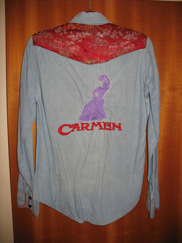
Probably one that does not include any of my typefaces in fact. It is called Fandangos In Space. Released in the UK in 1973, by the incredible flamenco-rock band called Carmen. It was a gate fold sleeve with wonderful pictures of the band members and what I think was hand lettering for their Carmen logotype. I later embroidered the back of a denim shirt with this lettering and a flamenco dancer.

Who or what do you consider to be your greatest influence?
Probably the Letraset Type Studio’s director Colin Brignall. Colin had a fantastic sense for new ideas, and a keen eye to spot our production errors! Also, the guy that first taught me to hand cut Rubylith film; Bob Newman.
Any upcoming projects or releases that you can share?
Yes, I have just released a new display typeface named Fantail. It has a connection with the fabulous Roy Orbison. The story is in the pdf available at my web site. Also I recently began a new version of my Letraset typeface “Spritzer.” This will be a more contemporary and quite different version, which it has to be, as I do not own any rights to any of the stuff created for Letraset. Outside designers were credited and paid royalties I believe. Staff designers had no credit on the Letraset sheets although we were sometimes named in publicity brochures and posters.

A big thanks to Philip for sharing all of these wonderful details. Also, one should note that Teen-Beat has recently re-released a special 7″ vinyl box set of Perfect Teeth, printed this time around with metallic gold ink.
Pingback: Afternoon Bites: Mel Brooks Interviewed, Unwound Live, “Funny Ha Ha,” and More | Vol. 1 Brooklyn
Pingback: - Ultimate CrossFit Charlotte, NC