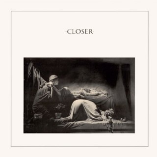
 Editor’s Note: We were more than pleasantly surprised when David Shaw contacted us to share his Belm Blog post on Joy Division’s Closer. Inspired by Eric’s post on Unknown Pleasures and a little Joy Division obsession, David really knocks it out of the park — and it’s our pleasure to re-publish it here. When not rocking that font, David is a music critic and amateur graphic designer. He blogs about music and design, but mostly about cooking.
As synchronicity would have it, I have been reading and watching a lot of media about Joy Division; Factory, their record label; and Peter Saville, Factory’s first graphic designer. Saville designed Unknown Pleasures, and somehow managed to follow up that feat a year later with another Joy Division icon, the cover of Closer. (The title is pronounced with a soft “s,” as in “more intimate” or “nearer to a goal,” not with a hard “z” as in “one who closes or concludes.” Pedantry, yes, but mispronouncing the name of this album will not put you in my good graces.)


