


Heaven is Whenever
Posted on 02/11/2011 by Shawn O'Keefe
Anthemic is a word that is thrown around a lot when describing rock music, but there is no doubt that The Hold Steady’s latest effort, Heaven is Whenever, qualifies for this special adjective.
While the band is now based in Brooklyn, vocalist Craig Finn grew up in Minnesota — and echoes of Minnesotan influences such as The Replacements and Hüsker Dü are certainly found on this record. However, the band has most definitely carved their own path of punk-derived catchiness, with Finn’s narrative ramblings garnering most of the well-deserved attention. It’s hard not to sing along to songs like “The Sweet Part of the City,” “The Weekenders” and “Touchless.” Infectious and anthemic indeed.

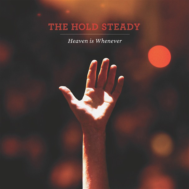
Texas-based Christian Helms worked with the band to design the artwork for Heaven is Whenever. A founding partner of The Decoder Ring Design Concern, Helms recently started the creative firm Helms Workshop. In addition to designing the packaging for The Hold Steady’s fourth studio album, Stay Positive, he’s worked with premier artists such as Death Cab for Cutie, Modest Mouse, Spoon, Wilco and many more. He just might know a thing or two about putting together a kick-ass album cover, so we sat down with him recently:
What is the biggest challenge for you when designing a packaging system for a band?
“Bands are really like any other client — they’re all different and come with their own unique viewpoints and problems to solve, so it changes every time around. I like that, and honestly need it. I’m awful at being decorative. I need a communication goal and problem to push against, or I’d have no idea what to do. With THS, we really wanted to find a metaphor to sum up the central theme of the album. It’s all about the contrast between the highs and lows in life, and it turned out the best way to achieve that was by throwing a model into a near-freezing greenbelt in February. We nearly gave him hypothermia.”
You use many wonderful serif typefaces in your work that give a timeless, almost vintage feel. Is this a conscious choice? Do you have any particular favorites that you often use?
“Personally I’m really drawn to vintage collateral and packaging. It surrounds me at home and at the studio, and it definitely influences the work. My goal is to reinterpret rather than recreate, so we try to use those influences as fodder for building something new. I do have faces that I tend to lean on a little more than others, but as of late I’ve been making a concerted effort not to do that. These days at the beginning of a project I’ll actually make a list of five things I’m not allowed to do. ‘No Century Gothic, no misregistration, no orange, etcetera.’ It can be frustrating, but it helps keep me learning and growing as a designer.”
There are two typefaces used on the cover, a nice pairing of Hoefler & Frere-Jones’ Archer and Mercury. (Chronicle was also used in the booklet.)
Archer is a slab serif initially commissioned for Martha Stewart Living magazine — a unique typeface that wonderfully blends the Antique and Geometric styles. While Heaven is Whenever doesn’t showcase the ball terminals of the lowercase, it does subtly reference this characteristic in the capital “S” of the band name.
The album title is set in Mercury, which was designed for the New Times newspaper chain. A culmination of over nine years of research and development, Mercury utilizes the feature of “grades”:
In his legibility research with the Poynter Institute, which culminated in Font Bureau’s Poynter Old Style (1997) series of typefaces, Tobias Frere-Jones had invented the idea of “grades” — sibling members of a type family that shared the same underlying geometry, but offered different degrees of darkness on the page. (Unlike the weights of a type family, which grow progressively wider as they get bolder, a font’s grades increase in color without affecting copyfit.) For the New Times, this meant that different regional editions could use different grades to counteract the local conditions of each press, in order to achieve the same end result. For other projects, grades offer the ability to separate typography from its printed medium, so that the type-warping effects of handmade paper, roll film, flat-panel monitors, or retroreflective sheeting can be all corrected for in the font itself.
Typographic heaven? It’s found whenever you combine top-notch talent with H&FJ’s elegant and innovative work.
Be the first to leave a comment