


The Suburbs
Posted on 09/27/2010 by Eric Hurtgen
Before having heard a note of the Arcade Fire’s latest album, I knew that I wanted to write about it. The cover art was immediately arresting and I knew it would be a great excuse to discuss hand-drawn fonts. Not that I hadn’t thought about discussing them already: Dinosaur Jr’s Bug, Pavement’s Slanted and Enchanted and The Pixies’ Come On Pilgrim are some old favorites of mine, both in terms of cover and content. Any one of them would have been a proper jumping off place. But, somehow it makes sense to start with this summer’s particular gem.
After having lived with The Suburbs for a couple months, I can firmly place it in my short list of favorite long players of the year, with its themes of isolation and suburban despair and the sleeve-worn musical influences that bubble to the surface. Not, possibly, as immediately accessible as either of Arcade Fire’s previous offerings, my appreciation of this current collection of songs was a slow burn, with a couple of false starts in there. In the end, it was the noise-soaked melodies that won me over, not necessarily the darker ideas of suburban ennui and apocalyptic sprawl.
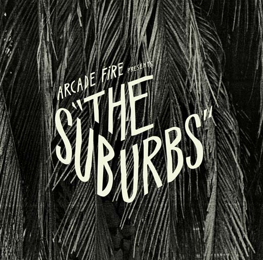
The album art seems like a perfect foil for the music: dark and moody, obviously familiar yet slightly foreign. The hazy projections of Gabriel Jones‘ photography (art directed by Vincent Morisset) keeps everything slightly out of reach. The letterforms keep their distance as well, mostly by hearkening back to the style of suspense films of the 1960’s. Caroline Robert, the designer who did the treatments and lettering for The Suburbs, told us that she, “…wanted the identity of the album to look like a title sequence of a classic movie. Like a screen shot.” Roberts said that she was really inspired by Saul Bass, the artist responsible for the opening animation sequences of films like Psycho, North by Northwest and The Man With The Golden Arm.
Originally, Robert tried to get the vintage look using existing fonts, but like Bass, she employed her own original handstyle to accomplish her ends. She explained that the cover came together once she started to draw the letters: “I imagined (the letters) as a cutout in the picture. I did a bunch of sketches using a brush then I chose one and traced it roughly in vectors.” The result was something decidedly organic, yet obviously geometric, like the interplay of curving suburban streets up against the straight lines of modern tract-home architecture. For my money, I think Robert hit all those proverbial nails on their corresponding heads, the cover perfectly sums up the inner content of the album.
So, here’s to hand-drawn fonts, arty albums and that kind of generalized ennui of the suburban teenage experience. I kind of wonder if it’s hard to have the one without the other.
Be the first to leave a comment