


Blood
Posted on 04/20/2010 by Shawn O'Keefe
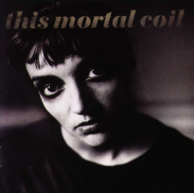
Supergroup This Mortal Coil, led by 4AD founder Ivo Watts-Russell, holds a unique place in post-punk and dream pop history. Just like the assortment of innovative artists who made appearances on Blood (from Kim Deal to Tanya Donelly and more), 4AD’s passion for great album cover design continues to influence today.
The sleeve for Blood was designed by Vaughan Oliver, famous for creating most of the identities for the 4AD bands we know and love: Cocteau Twins, Dead Can Dance, The Breeders, Pale Saints, Pixies, Throwing Muses just to name a few. As evident on this record, Oliver predominantly worked with photographer Nigel Grierson (Grierson left 23 Envelope in 1988 and Oliver continued on as v23).
The cover text for 1991’s Blood is in Bauer Bodoni Black Italic. This didone modern was drawn by Heinrich Jost in 1926, based on the work of Giambattista Bodoni of course. Considered to be more delicate and graceful than many other Bodoni interpretations, the extreme contrast between hairline and main stroke of Bauer Bodoni is a perfect fit for This Mortal Coil’s dramatic arrangements, atmospheric vocals and gothic spirit.
Bodonis have unique challenges in the digital age as well. From Wikipedia:
Digital Bodonis typically suffer from a particular kind of legibility degradation. Personal computers generate different sizes of type from a single font of type outlines using mathematical scaling, while printers working with metal type use fonts whose designs have been subtly adjusted to provide optical compensation for improved legibility at specific sizes — for example, opening up counters and expanding the character widths at small sizes. Typefaces like Bodoni tend to highlight these differences of technological application. Many digital revivals are based on designs adjusted for relatively large sizes, making the already thin hairlines very thin when scaled down. Some digital type designers are rediscovering the older lore of “optical scaling”, and subsequently turning out more sensible revivals aimed at pleasing human eyes.
How perfectly appropriate.
Black & White Photography: Nigel Grierson. Colour Photography: Claire Lazarus. Sleeve Design: Vaughan Oliver / v23
What Others Are Saying