


Bon Iver, Bon Iver
Posted on 11/18/2011 by Eric Hurtgen
It’s rare these days that an album grips me so completely as Bon Iver’s recent eponymous release. It’s an album in that classical, 60’s-era sense — every song is necessary and complete. Songwriter Justin Vernon has created a unified work that both touches on and transcends folk, soul, rock and chamber music. Maybe it’s Vernon’s work with Kanye West, maybe it’s his preoccupation with Bruce Hornsby, but Bon Iver, Bon Iver aims for the grand statement and wins; all the while managing to maintain that intimate scale that Vernon created on his debut, For Emma.
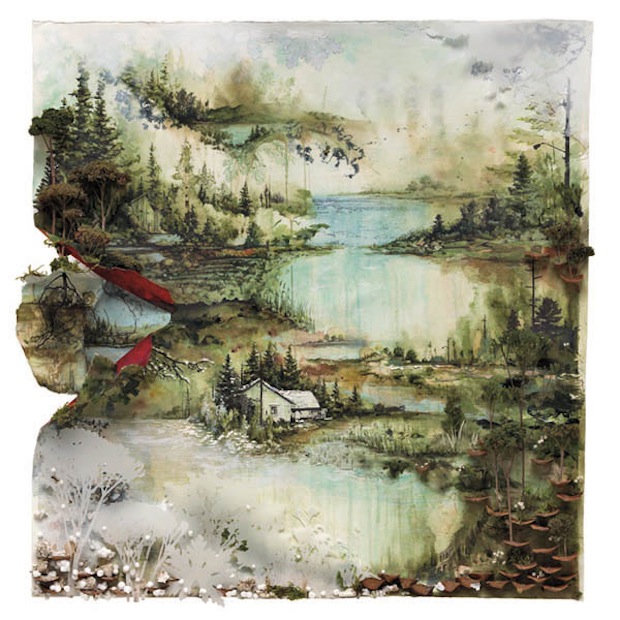
Fittingly, the album art manages to be both epic and minimal. Featuring the art work of Gregory Euclide, the cover is devoid of any other extraneous information. Throughout the packaging, designer and art director of Dead Oceans / JagJaguwar / Secretly Canadian, Daniel Murphy, keeps the layout simple and unadorned, balancing the intricacy of the artwork with the simplicity of a solid, unbroken scarlet red. As for traditional fonts, there are none. Murphy uses his own hand-writing for the whole project, giving the packaging a warm, organic feel.
Recently, I had the opportunity to talk to Daniel about the album artwork. Daniel Murphy is a serious artist and a serious thinker and the interview quickly moved far beyond discussing fonts and layouts straight into the ephemeral nature of music, album art in the digital age and the future of music packaging.
Was there any specific reason that you chose to hand-write all the titling, lyric and liner notes for Bon Iver, Bon Iver? Is that your normal handwriting?
As soon as I started talking about the direction we’d take for the art and layout of Bon Iver, Bon Iver, Justin had already decided that he wanted the two Gregory Euclide pieces to be the focal points of the packaging. Euclide’s work is incredibly intricate and organic, so we wanted to make sure that the rest of the layout maintained that handmade, organic feel, and didn’t compete with the images. We made a few attempts at putting together some sort of more formal typography, but it was quickly apparent that the layout needed to feel as simple and personal as possible – tying in to both the images and the general tone and mood of the record.
One of the most amazing things about the Bon Iver albums is how, though Justin’s lyrics can be incredibly impressionistic and really specific to his own experiences, listeners seem to find this rare level of personal, emotional resonance to the songs. They’re evocative in a universal way. I wanted the rest of the layout to communicate that same level of intimacy and personality, and with that in mind, writing it all out by hand was the only way to go. With the black text on a white field, and a few accents of bold red pulled from the center left area of the cover, the layout feels exceedingly simple, but still complete, and doesn’t distract from the depth and beauty of the cover image.
I tried emulating a few styles of handwriting from other sources, but the only thing that didn’t ultimately feel stilted and too considered was my own everyday handwriting. I practiced writing the titles over and over, stretching them out and simplifying them until they felt like signatures. That set the style for the rest of the layout. My own sloppy lazy-dude handwriting, stretched and simplified a little, ended up being a good foil for the lyrics. Making the somewhat obtuse words slightly illegible gives the listener a little more to decode and unravel, which is an aspect of record packaging I’ve always loved as a fan, and something I try to incorporate whenever possible in my work.
I like that idea of giving the listener something to decode and unravel. I felt like there was a kind of heyday of that kind of thing in the late 80’s / early 90’s. Do you have any examples of packaging that you loved as a fan first and then later became a conscious (or unconscious) inspiration?
Peter Saville’s work for Factory and Vaughn Oliver’s for 4AD were both huge influences on me as a teenage music fan and later as a designer, but the example that seems most appropriate here would be the packaging from The Fall’s albums throughout the 80s. As a fan I loved the idea of how they took the unhinged, goofy-but-menacing tone of their music and somehow found a way to enhance that with willfully obtuse artwork. The packaging is just packed with what seems like graphic non-sequitors – nonsensical handwriting and type, dense collages, photos and paintings that seem to have absolutely nothing to do with each other or the music, and seem very deliberately intended to be visually unappealing or at least overstimulating. On some of those records it’s nearly impossible to figure out the names of the songs. But that confusion IS their style, both musically and visually. The handwriting (probably Mark E. Smith’s) and collage feel of the art do much to contextualize the music and add another level to the experience of listening to the record.
That visual style — a seemingly deliberate attempt to merge punk and Situationist imagery (but with no actual cause to advocate) with the idea of outsider art — later became pervasive in indie rock thanks to Pavement (who are largely indebted to The Fall in just about every way possible) and in Stanley Donwood’s designs for Radiohead. Donwood has filtered a very similar aesthetic and tone through graphic design software to suit Radiohead’s fixation with technology. The disjointed images and handwritten text are still there, but it adds up to a much bleaker, more oppressive feeling that suits the records incredibly well. Donwood’s also big on maximizing the potential of physical packaging, and really making opening and unpacking the record an experience. I remember discovering months after the fact that there was a second booklet of artwork hidden behind the tray in the Kid A packaging, and how it drew me right back into the record again. I don’t think that either The Fall or Radiohead’s art is an obvious visual inspiration in the work I do, but they do help to remind me that design and packaging have an opportunity to deepen the experience of listening to a record. It can take a passive activity and make it active.
We’re in a unique time right now for music design. I know that no matter how deliberate the packaging and design of a record, at least half of the people who actually like the record enough to pay for it will likely never see anything beyond a JPEG in the corner of their iTunes. I’m guilty of this myself. The challenge, then, is to find a way to reward the people who are still willing to go out and buy a physical record. I see it as my job to find a way to make it more immersive. That’s not to say that people who download records are listening to them the wrong way – it is ultimately about the music, of course, and the music is strong enough to stand on its own. But if I can give a listener an excuse to actually sit down and spend time with the art while they listen, studying the images for hidden details, or reading through liner notes and lyrics that feel like letters from a friend, then I feel like that can only result in closer attention to the music itself.
It’s such a unique time in music. It seems like the whole system is being rewired — and as is usual with the push of new technology — we lose as much as we gain. I think of that period in the 1400’s after Johannes Gutenberg unleashed the power of mechanical, moveable type. Something fundamental was lost when people moved away from a primarily oral culture to an increasingly literate culture, but there was so much that was gained too. I feel like we’re in another transition period right now, between the more immediately physical version of music to this kind of disembodied format. And there’s such this great art form that I feel is in jeopardy — the record cover sleeve. Not to get too esoteric, but I feel like it’s been the visual art that’s been most embraced by the middle class. It’s been really subversive, I think. You’ve got the gallery guys, and that stuff is super interesting, but often, it just feels reserved for the elite class, even when it’s thumbing its nose at the elite, and then you’ve got advertising on the complete other end of the spectrum, where there’s just very little art, and then in the middle sits the album cover art. That was a long preamble to the next question: What do you do for the digital buyer? How do you translate album cover art for the completely digital age? Do you even try?
There’s a very real challenge in translating it, and I think it’s part of a larger issue with art in the digital age. In an odd way, it feels like this transition is opposite of the one that took place in the move from oral tradition to the printed word. So many things that we’ve taken as a given to be physical objects are returning to an ephemeral state. Music is always ephemeral to a degree – a fleeting moment captured on recording media to be re-experienced on demand. Packaging began as a means for protecting the media – an extension of that capturing of the ephemeral. Eventually its form evolved to copy that function. The entire physical object is an extension of the music. This has fundamentally changed the way we discuss the music itself, both as fans and as artists. Visual shorthand has become such a huge part of how music is contextualized. It’s easy, because up until recently, with the exception of pop radio, album artwork was the first impression listeners got of a record, either through advertising or in the store.
Digital distribution and leak culture have changed this completely. Records find their way onto the hard drives of fans (and eager detractors) sometimes before the artwork is publicized or even finished. And as previously mentioned, even hardcore fans of a record may never see the artwork beyond a JPG. The contextual power of album artwork has been diminished, which is both liberating and challenging. It removes the tendency to try to guide the conversation around a record, or to nudge artists in the direction of a style or movement via visual cues. That conversation begins earlier than ever, and in places where labels and music press have little if any sway. And it forces designers and artists to develop album art that makes a real statement on its own – one that complements the record but does not attempt to define it. It has to stand as its own thing. A thing that has traditionally, by necessity, been defined by the physical limitations of its original purpose: to protect the fragile media within. So what happens to the artwork when it no longer has that limitation and definition? If there’s nothing to package per se, how do we incorporate a visual element into the music?
The options available through most digital venues are limited. In practice most music packaging is translated into a full-screen PDF booklet that incorporates images and text from the artwork. To me this is more of a functional, informational tool – it gives the digital buyer access to lyrics and liner notes. But the necessary limits on file size and compatibility really hinder a good aesthetic translation of the album art. Which gets at the heart of the issue – what is the prime, definitive version of the artwork? As a designer trained in print and a record collector, for me that’s likely always going to be the LP. Everything else is an adapted version of that original artwork.
I acknowledge that this thinking gives short shrift to a predominantly digital audience, but in part I think that’s inevitable. The means for listening to digital music don’t currently leave much room for artwork, or control over how it’s viewed, both now and in the future. Sure, you can bundle videos or digital images with an MP3 download. But go find a CD from ten or even five years ago that included multimedia content. Chances are the first thing you will notice is that the quality is extremely poor by current standards. Digital technology evolves so quickly that it’s not possible to create a timeless accompaniment to the music. The artists I work with don’t want their music to feel dated in a few years, and in the same way I don’t want to bundle a record in digital artwork that’s going to look inept in a few years. The records deserve better than that.
The issue then is to find a way to incorporate digital art and technology into the music experience. In the same way that a great package can be immersive, I like that artists are trying to find a way to create a sense of community around their music that’s just as engaging, but has the ability to evolve and change with technology instead of being frozen in time. Fan forum sites have been around since the beginning of the internet, but I think that much like the way recording technology has been democratized, the access to web development tools has improved, and any band with a computer can put together a portal for their community to come together that’s also a living work of art. To me this is the digital analog to album artwork, rather than anything that is sold with a record.
Since we started this conversation with Bon Iver, I might as well bring them up here as an example. They rolled out a new website to coincide with the new album, and it combines the artwork, information, and social networking potential around the band into something really great. And Justin has really devoted himself to keeping it flush with new content, which is critical. It creates a visual, informational experience that finally matches the ephemeral nature of the music. It doesn’t replace album art – rather we’re moving forward with the opportunity to have two completely different but complementary visual treatments of a record. And in the same way that you don’t exactly have to buy a record to experience it digitally, an artful web presence isn’t something bands or labels are selling to fans. Like the joy of seeing a band live and being in the presence of other fans, it’s more an invitation to experience the culture around the music on a deeper level. It’s this notion that designers, artists and record labels need to embrace, rather than trying to find a way to squeeze our traditional notion of album artwork into a shoe that just doesn’t fit.
One more question for you: what’s next for you? What are you looking forward to?
Between the three labels (Jagjaguwar, Dead Oceans and Secretly Canadian) I do some degree of art direction and/or design on 40-50 releases each year, along with producing promotional and advertising materials for the records and the labels in general. So that keeps me incredibly busy. Most of our upcoming projects are still fairly hush-hush, but in particular I’m really excited about the warm reception given to the new album by The War on Drugs, and I’m looking forward to the upcoming release of Gauntlet Hair’s debut album. Both of these are great examples of artwork that I feel really serves the music well, and both were fun projects to work on.
I feel really lucky to be able to make a living doing something that I enjoy and feel passionate about, so I’m really just focused on continuing to do that. As long as people buy records, I’d like to be able to design some of them.
Be the first to leave a comment