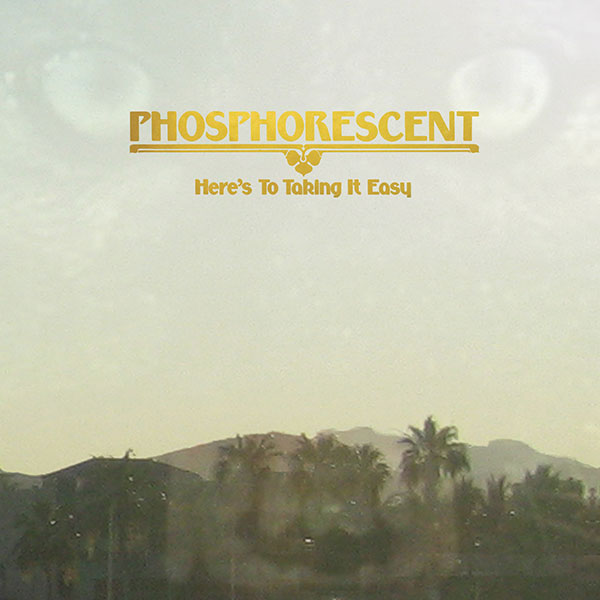
Here’s To Taking It Easy
Posted on 07/22/2010 by Eric Hurtgen
So it’s the middle of summer here in these United States. I live in the South, which means a lot of humid nights. Since it’s pretty much too hot to move much, the best evenings are spent lounging on porches, candles flickering, friends sitting around a table with a box fan and a bottle of wine, listening to something or other on the record player. This particular summer has seen Phosphorescent’s album, Here’s To Taking It Easy, on heavy rotation. It’s pretty much perfect southern summer fare — languid and loose, like Carolina in July. Matthew Houck’s meandering vocals provide the perfect foil for nights out in the heat. Maybe it’s because he’s originally from Northern Alabama, I don’t know.
The album cover itself is as sublime as the subtle twang of Houck’s voice. Designed by Daniel Murphy, the cover features a photograph — taken by Houck himself — of a hazy Southern California morning, a menacing wolf overlaid in the background (a recurring theme in Houck’s work). The thing that really sets it off is the decorative font printed in gold metallic, a really exciting and original choice.
The font is Rodin Sans and pretty much the best place to find it is in Dan X. Solo’s Moderne Alphabets. Published by Dover in 1999, the book is a treasure trove of amazing decorative fonts — 100 of them to be exact. As amazing as the book itself is the guy who selected the fonts — the legendary Dan X. Solo. A radio announcer and actor from San Francisco, Solo started collecting antique fonts in 1942, at the tender age of 14. By his early 30’s he was done with the broadcast industry and moved into selling his increasingly large collection of type to ad agencies. In the early 70’s, he started working with Dover on a collection of type books. From Solo’s bio on MyFonts:
I began to supply Dover Publications with mechanicals for books of 100 alphabets on a particular theme. I did 30 of these books over the years, and 30 more of printers’ ornaments, borders, and so forth. Sometime in the 1990s, Dover asked me to digitize books of 24 fonts each, to be sold with a disk in the back. I did 12 of these. The Dover relationship came to an end when Haywood Cirker, the owner and my special friend, died and the company was sold to another publisher. Dover felt that they had covered the type field thoroughly.
Other than a selection of type on MyFonts.com, Dan X. Solo has mostly gotten out of the font business, content to frequent the cruise ship circuit with his wife reading minds for entertainment. I wonder if he ever books porches in the South?


What Others Are Saying