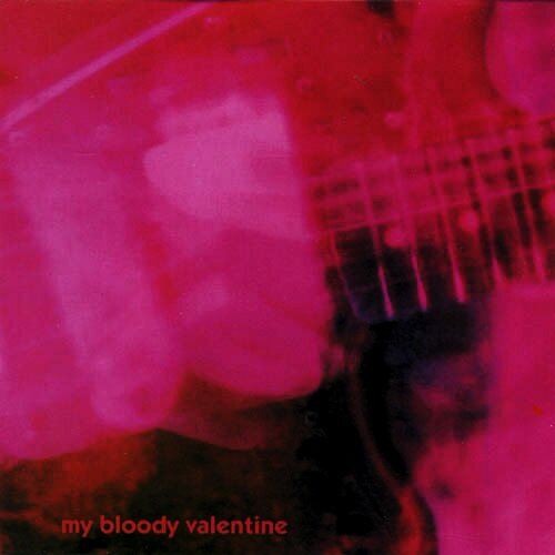
Loveless
Posted on 03/06/2010 by Eric Hurtgen
Editor’s note: Is there a more appropriate record to kick off this project? We didn’t think so.
it’s hard to believe that my bloody valentine’s loveless album is nearly 20 years old. the first time i heard it, way back in the early 90’s, it pretty much exploded my ideas about what pop music could be. when i first heard the careening, overdriven guitar swells of “only shallow,” i was in my room working on something or other. i had to stop and listen to the whole disc in its entirety before moving on to anything else, it’s one of those albums, like sonic youth’s daydream nation that begs to be listened to straight through. it was immediately timeless for me. it’s easy to understand why it would have been so hard for kevin shields to follow it up.
as for the typography, it did what you’d kind of want the words to do for a band like my bloody valentine—it got out of the way. minimal and small, it kept your attention on the fuzzed out pictures of shields’ jazzmaster all done up in pinks and reds. it fit perfectly with the music. but the font was always interesting as well, not quite as vanilla as helvetica or akzindez grotesk, it was closer to a mash-up of the bauhaus and a uk-style johnston typeface. i can’t be exactly sure, but it seems really close to kabel (bold), a font by the german typographer, rudolf koch. the diamond of the i and the smooth curves of the lower case give the best clues. if the font is, in fact, kabel, it would be kind of fitting as koch apparently designed it to honor the newly laid transatlantic telephone cable, a similarly paradigm-shattering event.


What Others Are Saying